One-page websites have become a go-to for startups, portfolios, and campaigns because they're fast to build and painless to maintain. But fast isn't always right. This post breaks down the real pros and cons of one-page websites, so you can decide based on your goals, timeline, and budget, not just what's trending on Awwwards.
TL;DR: key takeaways
- One-page sites suit focused messaging, single offers, or early-stage brand presence.
- You trade SEO depth and content scalability for speed and simplicity.
- Pick one page or multi-page based on goals and growth stage, not trends.
- Climate and deep-tech teams often outgrow one page when investors and technical buyers arrive.
1. What is a one-page website?
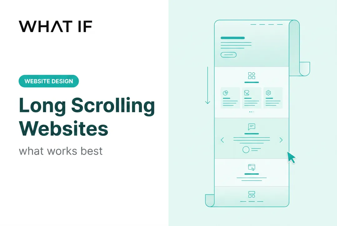
A one-page website is exactly what it sounds like: a single URL where all your content lives in scrollable sections, usually navigated through anchor links rather than a traditional menu.
Core characteristics include:
- Minimal navigation, often just jump-links to sections
- Mobile-first, linear layouts built for scrolling
- One continuous story: hero, about, offer, contact
- A single page load, no clicking between URLs
Think of it as a condensed landing page. Everything a visitor needs: your value proposition, offer, and contact form, sits in one flow instead of being scattered across multiple pages.
Don't confuse this with a "one-page app." That usually means a single-page application (SPA), where JavaScript updates content without full page reloads, as MDN's SPA glossary entry explains. That's a development pattern. A one-page website is a content and design choice.
2. The pros of a one-page website
2.1 Speed and simplicity win early
When you're racing to launch an MVP or a campaign page, fewer templates and less content planning means you ship faster. There's no need to plan navigation hierarchies or write copy for six separate pages.
A guided, single-scroll narrative also reduces decision fatigue. Nielsen Norman Group's research on choice and simplicity found that excessive options can cause fatigue, dissatisfaction, and abandonment, That finding supports funnelling visitors toward one clear CTA rather than scattering their attention.
Additional advantages:
- Lower cost and maintenance - no complex CMS, no juggling multiple hosting configs
- Mobile-friendly by default - a single scrolling layout adapts naturally across screen sizes
- Purpose-built for narrow use cases - portfolios, event pages, product launches, and early-stage landing pages
Mobile traffic makes that layout choice practical: devices made up 51.48% of global website traffic in Q2 2026, according to Statista's mobile traffic data.

If your entire pitch fits into one clear story, no format tells it faster.
3. The cons of a one-page website
3.1 The ceiling shows up fast
The same simplicity that makes one-page sites fast to build becomes a liability once your content gets complicated.
Where one-page sites struggle:
- Limited SEO reach: one URL can't cover multiple search intents. Search Engine Journal notes single-page sites usually centre on one concept, so keyword coverage stays narrow
- Content ceiling - technical offerings (carbon capture chemistry, grid interconnection science, detailed case studies) get cramped when forced into one scroll
- Weaker analytics granularity - it's harder to tell which section actually drove a conversion versus tracking distinct page-level performance
- Scroll fatigue - visitors hunting for a specific detail have to scroll past everything else to find it
- Limited scalability: as your product line or content grows, a one-page format often needs a rebuild, not an expansion
See how we have approached this in practice: Landing page design for climate and deep-tech founders.
This last point hits hard for technical, evidence-heavy companies. With climate tech clients, dense scientific content often creates cognitive overload, and visitors decide whether to stay or leave in under 30 seconds.
Susteon, a carbon capture company we worked with, hit the same wall. Their site couldn't explain the technology clearly to investors and partners, so engagement with those audiences stayed limited.

4. One-page vs. multi-page: how to decide
Audience needs and content volume should drive the choice, not design trends.
Choose one-page when:
- You're promoting a single event, product, or portfolio
- You have one clear call to action
- Your audience arrives with one question, not several
Choose multi-page when:
- You need SEO breadth across multiple search intents
- You speak to distinct audiences: investors, customers, partners, with different information needs
- Your offering requires in-depth technical explanation
For climate tech, deep-tech, and frontier tech founders, a hybrid approach often works best: a strong one-page core paired with linked deep-dive pages for science, funding, or partnerships.
At What if Design, website work usually starts by mapping buyer journeys for investors, engineers, partners, and CFOs, then assigning content to match each intent. Technical specs go where engineers look. ROI data goes where CFOs look. That split is hard to pull off cleanly on a single scroll.

5. Best practices if you choose a one-page website
If a one-pager fits your stage, build it well.
Add anchor links and sticky navigation - let visitors jump between sections instead of scrolling blind. The W3C's guidance on in-page navigation recommends any section with an
idcan serve as a jump target, with visible permalinks where possible. 2. Keep copy scannable - strong headings, bullets, and one unmistakable CTA repeated at key intervals.Protect page speed - optimise images and lazy-load anything below the fold. Google benchmarking found average mobile landing pages took roughly 15 seconds to fully load, and 70% took more than 5 seconds to show visuals. One page does not automatically mean a fast page. 4. Structure content for future scalability - build sections as modular blocks so they can split into standalone pages later without a full rebuild.
Get this right and you get alignment: your team, your investors and your buyers all read the same story the same way. Get a free strategic audit.
6. Frequently asked questions
6.1 What is a one-page website?
A single-URL website where every section: about, offer, and contact, lives in one scrollable layout. It's commonly used for landing pages, portfolios, and single-product promotions.
6.2 Are one-page websites free?
Many builders offer free basic plans, but expect limitations like a branded subdomain and no custom domain. For example, Wix's free tier uses a wixsite.com URL, and custom domains require an upgrade.
6.3 What is a one-page app?
This refers to a single-page application (SPA), a technical setup where JavaScript updates content dynamically without full page reloads. It's a development pattern, not a website content structure.
6.4 Do one-page websites hurt SEO?
Ranking for multiple keywords is harder with just one URL, but strong heading structure and focused content can still perform well for niche or branded searches.
6.5 Can I convert a one-page site into a multi-page site later?
Yes, and it's common as businesses grow. Structuring your content in modular sections from the start makes that transition much smoother.
6.6 Are one-page websites good for startups raising funding?
Simple one-pagers work fine for early awareness. Technical startups, especially in climate tech, often need supporting pages for specs, ROI data, and trust signals to satisfy investor due diligence.