It looks deceptively simple: hand someone a checklist, have them click through your product, done. But results vary wildly. A single evaluator with no training and a vague scope will miss most of what matters. The method only works when you get the setup right.
This guide walks through the exact steps, the variables that make or break your results, common mistakes, and where heuristic evaluation fits alongside other 2026 UX methods.
TL;DR: key takeaways
- Expert-led review of an interface against usability principles, commonly Nielsen's 10 heuristics
- Takes 1 to 2 days and costs far less than full usability testing, ideal for early design stages
- Best results need 3 to 5 independent evaluators, a tightly scoped task, and severity ratings to prioritise fixes
- Complements real user testing; it does not replace it
1. Step 1: choose your heuristic set and define scope
Start with Nielsen's 10 usability heuristics. Add supplementary criteria only when the domain demands it: voice interfaces, AI-assisted dashboards, or similarly specialized products.
Narrow your scope before you begin. Evaluating an entire product produces shallow, scattered findings. Pick one flow instead:
- Onboarding sequence
- Checkout or payment flow
- Dashboard or reporting view
- A single high-friction feature
Then lock the specifics: which persona, what task, and which device. A grid-interconnection dashboard reviewed as "a utility engineer checking outage status on a tablet" yields sharper findings than "evaluate the dashboard."
2. Step 2: assemble and train evaluators
This is where most evaluations fall apart. Nielsen and Landauer's foundational research found that a single evaluator catches only around 35% of usability issues on average, ranging from 19% to 51% across six projects (NN/g). One person, no matter how skilled, isn't enough.
Recruit 3-5 independent evaluators. NN/g's research shows this range balances coverage against diminishing returns from adding more reviewers. Pick people who understand UX heuristics but did not design the product, independence matters more than job title.
Before the live review, run a short calibration so everyone applies the heuristics the same way:
- Run a short practice round on a familiar, simple app (a to-do list, a basic e-commerce site)
- Compare notes as a group to align on how everyone interprets each heuristic
- Confirm the format: a shared spreadsheet with columns for heuristic, screen, issue description, and recommendation

Skip this step and you will get uneven severity ratings and notes you cannot merge cleanly.
3. Step 3: conduct independent evaluations
Each evaluator should complete two passes through the interface:
Pass one: Walk through the task simply to learn the layout and flow. No judging yet, just familiarisation.
Pass two: Go screen by screen, checking each element against every heuristic. Document each issue with:
- What's wrong
- Where it appears
- Which heuristic it violates, and why
"This feels confusing" tells nobody anything useful.
Timebox each evaluator to 1-2 hours. This keeps findings comparable across reviewers and prevents any single person from over-analysing one screen while skipping others.
4. Step 4: consolidate, rate severity, and prioritize
Once all evaluators finish independently, merge the findings into one master list. Expect overlap. Multiple evaluators flagging the same issue is a good sign, not redundant noise. Remove true duplicates, but keep a count of how many reviewers caught each problem, frequency is a signal.
Apply Nielsen's 0-4 severity scale:
| Score | Meaning |
|---|---|
| 0 | Not a usability problem |
| 1 | Cosmetic only, fix if time allows |
| 2 | Minor issue, low priority |
| 3 | Major issue, high priority |
| 4 | Usability catastrophe, fix before release |

Average scores across evaluators. When ratings differ by two or more points, discuss in a short debrief before locking the final severity.
Priority is not severity alone. Rank fixes using:
- Severity: impact on task completion and user trust
- Frequency: how many evaluators found it, and how often it appears in the product
- Business impact: effect on conversion, adoption, support load, or compliance
Hand design and product a concise list: issue, heuristic violated, severity, frequency, and a suggested fix. That package is enough to schedule work without re-litigating the evaluation.
5. When should you conduct a heuristic evaluation?
Heuristic evaluation inspects your interface against known principles. It doesn't observe real user behaviour, so it's the wrong tool for some questions.
It works best for:
- Early design or prototype review, before you've invested in a full build
- Competitor analysis and benchmarking
- Pre-launch sanity checks
- Budget-constrained projects that can't afford full usability testing
- Post-redesign audits to catch regressions
For companies building technically complex products, such as climate tech or deep-tech platforms, this method has an added wrinkle: the in-house team often understands the science deeply but has limited UX bandwidth to run a rigorous, unbiased review.
An external specialist like What if Design can close that gap, bringing senior-level UX rigour to hard-to-brief products, from battery management systems to ESG reporting tools.
It's insufficient alone when you need to:
- Validate actual conversion behaviour with real traffic
- Understand novel or highly complex user journeys nobody has mapped
- Convince stakeholders who need real user evidence, not expert opinion
See how we have approached this in practice: How to evaluate a UI/UX agency - A vendor scorecard.
6. Key heuristics and parameters that affect results in 2026
Your results depend heavily on which heuristics you apply, how you score severity, which tasks you put in scope, and how consistently evaluators interpret each rule.
6.1 Visibility of system status and feedback
Users need constant confirmation that a system is responding, especially in AI-driven or asynchronous flows where processing isn't instant. Missed feedback loops (a spinner that never resolves, a silent multi-step form submission) create confusion fast in complex workflows.
6.2 Consistency, standards, and recognition over recall
As products add features and screens, inconsistent patterns become the top source of flagged issues. A 2006 study evaluating a health record system found Consistency and Standards violations accounted for 24% of all flagged issues (Scandurra et al.), the highest single category.
A 2024 systematic review of mobile health apps found this heuristic flagged in 14 of 17 studies, among the most frequent overall. That same inconsistency forces users to recall how each screen works instead of recognising familiar controls, another reason this pair of heuristics surfaces so many findings.

6.3 Error prevention and recovery
This matters most in data-heavy or technical dashboards, where a single mistaken input can carry real consequences. A study of inline form validation found it produced a 22% increase in success rates, 22% fewer errors, and a 42% decrease in completion time compared to standard validation (A List Apart).
What if Design's work on Batteryze, an EV battery-management platform, involved similarly data-dense screens: state of charge, health scores, and risk ratings all displayed at once. In dashboards like this, one misread field can trigger a costly downstream decision, so reviewers should treat error prevention as its own pass, not a side note.
6.4 Accessibility and inclusive design
This is the 2026 addition that most evaluators still skip unless specifically trained to check for it. A recent classroom comparison found that ability-focused accessibility heuristics identified an average of 18.50 issues per evaluator, compared to 10.18 using standard Nielsen heuristics alone (ACM CHI, 2026). Standard heuristic reviews leave real accessibility gaps if nobody checks for them on purpose.
7. Common mistakes and troubleshooting during heuristic evaluation
Mistakes to avoid:
- Using only one evaluator, missing roughly two-thirds of the issues that additional reviewers would catch
- Letting evaluators compare notes before finishing their own independent pass, which biases everyone toward the first opinion voiced
- Writing vague notes like "this feels confusing" instead of tying every observation to a specific heuristic and screen location
Troubleshooting:
If findings look inconsistent across evaluators, don't merge and move on. Return to training and align on heuristic definitions as a group before the next round.
If low-severity issues dominate the list, tighten severity-rating criteria. Refocus on high-impact tasks instead of cosmetic nitpicks that consume debrief time.
8. Alternatives and complementary methods to heuristic evaluation
Heuristic evaluation is fast, but it is not the only way to surface usability problems. Use the methods below when you need behavioural proof, learnability checks, or outside expertise.
8.1 Usability testing with real users
Use usability testing when you need to validate actual behaviour or uncover context-specific confusion no expert would predict. NN/g's simple three-day workflow tests five users.
The trade-off is cost and time. A remote moderated study in the US typically runs $415 to $1,680 plus 32-48 researcher hours (NN/g), against a heuristic evaluation's 3-10 total evaluator-hours.

8.2 Cognitive walkthroughs
Choose cognitive walkthroughs to assess learnability of a new feature, step by step, from a first-time user's mental model. Scope is narrower: you test task completion, not the whole interface for broad issues.
8.3 Partnering with a specialised UX design team
When internal teams lack bandwidth or domain-specific UX expertise, especially on technically complex products, outside help often reaches reliable findings faster than building the skillset in-house.
What if Design's team has evaluated battery-health platforms, ESG vendor tools, and enterprise dashboards for the Ministry of Health, Saudi Arabia. That range matters: a fleet-management dashboard needs different judgement than a consumer checkout flow.
You trade the added cost of external expertise for faster, more objective results than an internal team stretched across five other priorities.
9. Conclusion
Heuristic evaluation in 2026 works best when three things are deliberately set up: scope, evaluator training, and heuristic selection. Skip any of these and you get inconsistent, low-value findings.
Most missed issues trace back to single-evaluator reviews or vague documentation, not a flaw in the method itself. Get the fundamentals right and heuristic evaluation remains one of the fastest, cheapest ways to catch usability problems.
Pair it with real user testing when the stakes are high enough to justify the extra cost. Expert-led principle review plus real behavioural evidence gives you the most reliable, business-aligned outcome.
A site that reflects the company you have actually become is the cheapest credibility you can buy, and it puts you back in control of the first impression. Get a free strategic audit.
10. Frequently asked questions
10.1 What are the 10 Nielsen heuristics for usability evaluation?
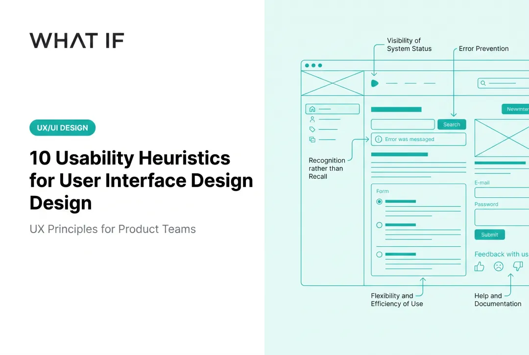
They are: visibility of system status, match between system and the real world, user control and freedom, consistency and standards, error prevention, recognition rather than recall, flexibility and efficiency of use, aesthetic and minimalist design, help users recognize, diagnose, and recover from errors, and help and documentation.
10.2 What are heuristics in UX design?
Heuristics are broad, research-backed rules of thumb for judging whether an interface will feel intuitive. They're not strict rules, just proven starting points for spotting likely usability problems.
10.3 How to perform a heuristic evaluation?
Choose your heuristic set and scope, train evaluators, have them review independently, then consolidate findings and prioritise by severity. Four steps, in that order.
10.4 What is the difference between heuristic evaluation and usability testing?
Heuristic evaluation is expert-led and principle-based, without real users. Usability testing observes actual users completing tasks. They're complementary, not interchangeable.
10.5 How many evaluators do you need for a heuristic evaluation?
Three to five independent evaluators is the recommended range. It balances solid issue coverage against the cost and coordination effort of adding more reviewers.
10.6 Can heuristic evaluation be used for AI-powered or voice interfaces in 2026?
Yes. Heuristics apply broadly across interface types, but AI-driven and voice interactions demand extra attention to feedback clarity and error recovery, since users can't always see what the system is doing.