Choose well, and you get faster time-to-market, cleaner investor conversations, and a partner who catches problems before they become expensive. Choose poorly, and you're rebuilding six months of work. This is where a vendor scorecard comes in: a structured way to compare agencies on criteria that actually predict performance, not just portfolio polish.
TL;DR: key takeaways
- Replace gut-feel hiring with a weighted scorecard: research, domain fluency, process maturity, communication.
- Portfolio aesthetics ≠ execution quality; prioritize outcome narratives and shipped work.
- Domain fluency is non-negotiable for technical and niche products.
- Skipped discovery and vague answers about past decisions are immediate red flags.
- Re-score agencies at project milestones, not once at hire.
1. What is a UI/UX agency vendor scorecard?
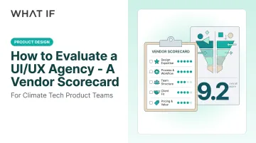
A vendor scorecard is a structured checklist used to score and compare UI/UX agencies against weighted criteria: capability, fit, and commercial, instead of relying on impressions from a single discovery call or a polished case study reel.
In practice, it's usually a simple spreadsheet. Each category gets a score, typically on a 1 to 5 scale, applied consistently across every agency on your shortlist. That consistency is what makes it useful: you're comparing apples to apples instead of comparing "the agency with the nicest deck" to "the agency the founder liked personally."
1.1 Core components of the scorecard
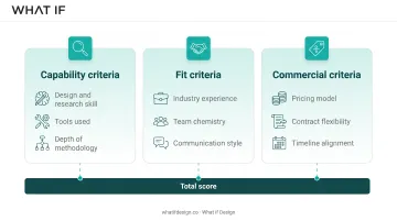
The scorecard breaks evaluation into categories that mirror how an agency will actually operate once you've signed a contract. Three buckets cover most of it:
- Capability criteria: design and research skill, tools used, and depth of methodology.
- Fit criteria: industry experience, team chemistry, and communication style.
- Commercial criteria: pricing model, contract flexibility, and timeline alignment.
Score each bucket independently before rolling up to a total. This keeps a strong salesperson from masking a weak research process, and it keeps a great portfolio from hiding a rigid, unworkable contract.
2. Why a structured evaluation beats gut-feel hiring
Gut-feel hiring rewards whoever pitches best, not whoever delivers best. A structured evaluation fixes that in a few concrete ways:
- Reduces bias toward flashy visuals over problem-solving depth
- Surfaces process gaps (like skipped research) before you sign anything
- Creates accountability you can point back to mid-engagement
- Speeds internal alignment when multiple stakeholders are voting on the decision
Nielsen Norman Group's analysis of 72 usability redesign case studies found an average business-metric improvement of 83%, with roughly 12% of projects seeing 10x gains or more. That's historical data, not a guarantee. Still, it shows design quality moves real business metrics, not just aesthetics.
A scorecard is how you filter for agencies capable of that kind of outcome, before you've spent budget finding out the hard way.
3. Key factors to score when evaluating a UI/UX agency
These categories form the backbone of the scorecard. Score each one independently, then calculate a weighted total. Weighting isn't fixed. A climate hardware or deep tech company should weight domain fluency heavily, while a consumer app redesign might weight it lightly and prioritize speed instead.
3.1 Portfolio depth & proof of outcomes
Visual polish tells you an agency can make things look good. It doesn't tell you they can solve your problem. Look past the mockups to the problem-solution-outcome narrative: what was broken, what did they change, and what happened afterward?
Ask for specific KPIs tied to the work:
- Task completion improvements
- Conversion lifts
- Funding or partnership outcomes tied directly to the design deliverable
Warning sign: a portfolio full of concept mockups with no links to shipped, live products. Concepts are cost-effective. Shipped work that survived contact with real users is proof.
3.2 Industry & technical domain fluency
An agency without domain context can produce work that looks right and is functionally wrong: a dashboard that misrepresents how a carbon capture system actually behaves, or a battery monitoring UI that hides the metric an engineer actually needs. It looks finished. It isn't.
This is where specialized studios earn their fee. What if Design, for example, learns the underlying science and market before touching a screen. Its team has designed asset-tracking dashboards for the Ministry of Health of Saudi Arabia and gone deep on hydrogen and carbon-capture technology for climate ventures.

💡 Working through this decision right now? If you're a climate-tech or deep-tech founder weighing this trade-off, Book a strategy call with our team, 25 minutes, no pitch, and we'll pressure-test your specific situation.
Ask any shortlisted agency to describe a project outside their comfort zone and how quickly they got functional in the domain. Vague answers here are telling.
3.3 UX research & strategic process maturity
A mature process puts discovery and research before UI screens, not after. Nielsen Norman Group's UX Maturity Model treats systematic research use throughout the product lifecycle as a defining marker of higher-maturity teams. That practice separates design-by-guess from design-by-evidence.
See how we have approached this in practice: 10 Best SaaS UX Design agencies for product growth in 2026.
Verify the process directly. Ask about:
- User interviews and how many were actually conducted
- Competitor analysis and what it changed
- Usability testing on early prototypes, not just final builds
- A specific example of a finding that altered a design decision
If an agency can't point to a moment where research changed their mind, the research probably wasn't real.
3.4 Design system & scalability readiness
Reusable, documented components keep a product consistent as it grows and cut down on rework every time engineering ships a new feature. This matters more than founders expect early on. Inconsistency compounds fast once you have multiple screens and multiple developers touching them.
One useful data point: Grammarly's internal survey found its design system saved design and development teams 25% of their work week. That's a single company's result, not an industry average, but it illustrates the scale of savings a documented system can unlock.
Ask agencies for evidence of reduced design-to-dev handoff time or fewer UI inconsistencies across past releases.
3.5 Team structure, communication & collaboration
Responsiveness and staff seniority directly affect delivery quality. A junior team that goes quiet for a week produces very different outcomes than a senior strategist who stays engaged past kickoff.
A measurable signal worth testing: run a small paid trial and clock the average response time. Also ask whether the senior person who impressed you in the pitch actually stays on the account, or whether work gets handed off once the contract is signed.
3.6 Engagement model, cost & agile fit
Pricing structure matters as much as price. A rigid fixed-scope contract can trap a startup whose roadmap shifts every quarter, while a flexible retainer or subscription model absorbs those changes without renegotiation.
Score agencies on:
- Cost per milestone, not just total contract value
- Contract flexibility clauses (can scope scale up or down?)
- Turnaround time versus your in-house hiring timeline
4. Red flags that should lower an agency's score
Some warning signs should immediately drop an agency's score, regardless of how strong the rest of the pitch looks:
- Skipping discovery: Jumps straight to UI screens without understanding the problem
- Isolated screens: No problem statement, rationale, or outcome attached
- No data behind decisions: Can't explain past choices when asked directly
- Fixed visual "style": Template-heavy delivery that ignores your business context
- No references: Won't share multi-phase or long-term client relationships
References are the clearest filter. An agency confident in its work will connect you with a client from a year-long engagement. One that dodges the request usually has a reason.
5. How What if Design scores against this vendor framework
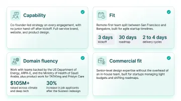
Running What if Design through this same scorecard illustrates what a strong fit looks like for climate tech, deep tech, and sustainability-focused teams:
- Capability: Co-founder-led strategy on every engagement, with no junior hand-off after kickoff. Full-service brand, website, and product design keeps one team carrying context end to end.
- Fit: Remote-first team split between San Francisco and Bangalore, built for agile startup timelines. Kickoff within three days of signup, a defined 30-day roadmap, and two-to-four-day delivery cycles with Slack updates and Loom walkthroughs.
- Domain fluency: Work with teams backed by the US Department of Energy and ARPA-E, enterprise design for the Ministry of Health of Saudi Arabia, and product work for unicorns like TATA1mg and Pristyn Care. Clients have raised more than $105M across climate and deep tech. One result: a Susteon redesign that drove a 30% increase in job applicants.
- Commercial fit: Senior-level design expertise without the overhead of an in-house team. Built for startups managing tight budgets and shifting roadmaps.
No agency fits every brief. This is a specific, checkable case for teams whose product is genuinely hard to explain, which is the gap a scorecard is built to catch.
6. Conclusion
Your goal is the agency that scores highest against your technical, commercial, and collaboration needs, not the one with the most decorated portfolio. A structured scorecard is how you find that answer instead of guessing.
Don't file the scorecard away once you've signed a contract, either. Revisit it at each project milestone. An agency's performance in month one doesn't guarantee the same quality in month six, especially as staff shift or scope expands.
Treat the relationship as something that evolves, not a transaction you complete once. The best partnerships get re-evaluated, adjusted, and deepened over time when they work.
Clarity here is what turns a defensive conversation into a confident one. Get a free strategic audit.
7. Frequently asked questions
7.1 What is the 60-30-10 rule in user experience design?
The 60-30-10 rule is a color-distribution guideline: roughly 60% dominant color, roughly 30% secondary color, and roughly 10% accent color across a screen for visual balance. A strong agency should be able to explain fundamentals like this clearly and quickly during evaluation.
7.2 What are the golden rules of UI design?
Ben Shneiderman's eight golden rules include consistency, informative feedback, error prevention, and easy reversal of actions. Asking a shortlisted team to explain a few of these is a quick literacy check, not a deep test.
7.3 What is the most important factor when evaluating a UI/UX agency?
No single factor dominates every project, but research maturity and domain fit are close to universal must-haves. An agency that skips discovery or misunderstands your industry will struggle regardless of visual skill.
7.4 How many agencies should I run through a scorecard before deciding?
Three to five shortlisted agencies gives you meaningful comparison without tipping into decision fatigue. Fewer than three limits your data; more than five just slows down the decision.
7.5 Should cost be weighted above capability in a vendor scorecard?
No. Underqualified agencies often cost more in the long run through rework, delays, and missed milestones. Weight capability and fit first, then use cost to break ties between comparably strong options.
7.6 How do I evaluate a UI/UX agency if I'm not a designer myself?
Lean on the structured scorecard, commission a small paid trial task, and ask each agency to explain their decisions in plain business language. If they can't justify a choice without design jargon, treat that as a red flag.
Ready to take the next step?
If you're weighing a design partner for climate, deep tech, or hard-to-explain products, Book a strategy call with our founders at What if Design, a no-pressure 25-minute conversation about what you're building and where design can help. You can also View our work to see how we've helped teams like yours, or Get a free strategic Audit of your current brand, website, or product experience.