Key Takeaways
- Research-backed design focuses on actual user workflows rather than assumptions, cutting adoption friction across complex multi-user products
- Clear information architecture helps users complete core tasks faster and with less frustration. The structure of your navigation directly determines whether new users can find value independently.
- Deliver quick wins during onboarding: products with early "aha moments" retain 69% more users over the first three months
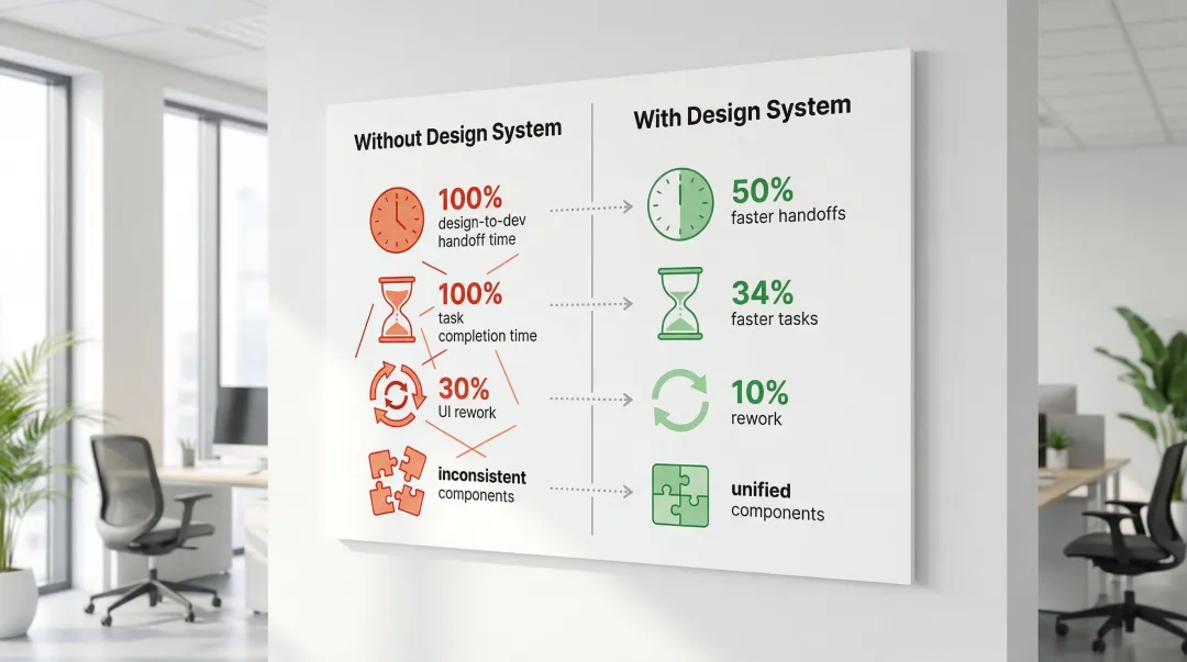
- Design systems cut handoff time in half and reduce UI rework from 30% to around 10%, according to a fintech SaaS case study
1. Why SaaS UI/UX design matters in 2026
Your product works. Your team knows it deeply. But new users are signing up, poking around for a few days, and quietly leaving. Not because the technology failed them, but because the interface never gave them a reason to stay.
For climate and energy software startups, this problem compounds quickly. You're selling complex tools (carbon accounting platforms, grid analytics dashboards, ESG reporting systems) to buyers at utilities, enterprises, and industrial operations who already have low tolerance for friction. When your onboarding is rough, your navigation is unclear, or your core workflow takes too many steps to reach value, it doesn't just hurt retention. It creates doubt about the product's readiness, which is the last thing you need when you're trying to close a skeptical enterprise buyer or demonstrate traction to your next investor.
This guide covers six design practices that directly address those gaps: from structuring your interface around user goals rather than feature lists, to building onboarding flows that get users to their first meaningful outcome within minutes. Each practice reflects what actually drives results: faster activation, stronger retention, and a product experience that builds the kind of trust your sales cycle depends on.
The underlying argument of this guide is simple: UI/UX quality in climate and energy software is not just a design concern. It's a procurement credibility problem. Every rough edge in your interface is something an enterprise evaluator notices, and something your sales team has to work around.
In 2026, several forces are converging to raise the stakes on product experience for climate and energy software teams. Enterprise procurement teams are more UX-literate than they were five years ago. Buyers shaped by well-designed consumer software now apply the same expectations to B2B tools, and promises to improve the interface after launch no longer satisfy skeptical procurement committees. The climate software market is maturing: first-mover advantage is eroding as competitors multiply, which means product experience has become a meaningful differentiation lever in ways it wasn't during the early adoption phase. WCAG 2.2 is now the accessibility compliance baseline that government and utility contracts increasingly specify. And with AI-assisted design tooling becoming standard across product teams, there's less excuse for shipping rough interfaces. The standard for what institutional buyers consider acceptable keeps rising.
According to retention benchmarks from Amplitude, over 98% of new users abandon SaaS products within 14 days if they don't quickly recognize value. That number tracks with what we see in practice: the drop-off usually happens before users ever reach the product's core value, not after. The six practices below address exactly that.
This guide covers six evidence-backed practices:
- User-centered design research
- Intuitive navigation architecture
- Effective onboarding systems
- Scalable design systems
- Performance optimization
- Accessibility compliance
Each practice connects to measurable outcomes: higher conversion rates, reduced churn, and a product experience that earns trust from demanding buyers.
2. Start with user-centered design and research
2.1 Understanding your users
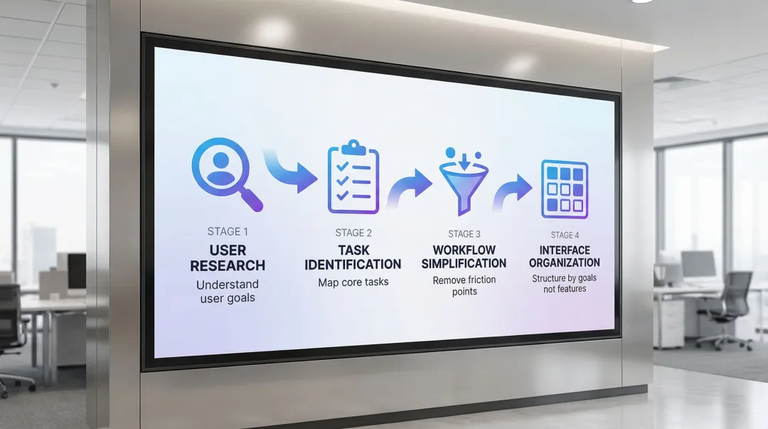
For climate and energy software teams, user research often gets deferred under pressure to ship. That's a costly pattern. The teams that conduct even a handful of structured interviews with utility or industrial buyers before finalizing their navigation architecture close the feedback loop much faster and avoid rebuilding flows that didn't match how their buyers actually work.
Start by gathering concrete data about who will actually use your product. The most useful methods:
- User interviews reveal motivations and frustrations that analytics can't capture
- Surveys collect quantitative data about feature preferences and usage patterns
- User testing shows how real users interact with your interface and where they struggle
- Analytics review tracks behavioral data to understand where users abandon tasks
- Persona creation documents detailed user profiles including demographics, goals, and challenges
Combine quantitative metrics with qualitative insights to pinpoint where workflows break down. Tools like Dovetail help organize feedback and identify patterns across interview data. When you can articulate your users' workflows accurately and show that the interface was built around how those users actually work, it builds credibility with enterprise procurement teams assessing whether your product will get adopted.
2.2 User empathy and journey mapping
Map the complete user journey from initial awareness through power user status, identifying critical touchpoints and potential friction points at each stage.
Design for different user segments with distinct needs. Beginners need clear guidance and simplified interfaces, while power users require efficient shortcuts and advanced features. Administrators need comprehensive control and reporting capabilities, while end users need streamlined task completion. Technical users expect detailed specifications, while business stakeholders need high-level insights.
In an enterprise evaluation for a carbon management or ESG reporting tool, these distinctions matter directly. The compliance officer and the operations lead are navigating the same product with different goals. When your product handles those distinctions clearly, both can demonstrate value to their own stakeholders without relying on your team to guide them through every screen.
2.3 Task-driven design approach
Prioritize design around the core tasks users need to complete rather than feature lists. Users at utilities or manufacturing operations aren't exploring your product casually. They have a defined job to do. Designing around that job, rather than around every capability your platform offers, is what separates tools that get embedded into daily workflows from tools that get trialed and quietly abandoned.
Simplify workflows by removing unnecessary steps. Each additional click, form field, or decision point increases cognitive load and the likelihood a user abandons the task entirely. When designing carbon accounting or grid analytics tools, structure the interface around the tasks users actually perform (running a scenario analysis, exporting a compliance report, comparing facility performance) rather than organizing by technical capability. Slack's approach of organizing around communication tasks rather than technical features reflects the same thinking.
3. Create intuitive navigation and information architecture
3.1 Clear navigation patterns
For carbon management platforms, grid analytics dashboards, and ESG reporting tools, navigation design has to account for something most generic SaaS products don't face: multiple user roles accessing the same product with entirely different objectives. An operations manager and a compliance officer aren't doing the same tasks, and your navigation structure needs to reflect that distinction clearly.
Choose navigation patterns based on your application's complexity and user needs:
- Top navigation: Best for simple applications with 5-7 main sections
- Sidebar navigation: Ideal for complex applications with multiple feature categories
- Breadcrumbs: Essential for deep hierarchies to show users their current location
In our navigation work with climate software teams, role-based navigation is consistently one of the first structural changes that reduces friction during enterprise pilots. When an evaluator from each department can independently navigate to what's relevant without a sales engineer present, your product demonstrates enterprise readiness. That's often exactly what procurement teams are testing for. Place the most-used features in accessible locations, typically the top-left of sidebars or the left side of top navigation bars, and organize them around user goals rather than feature categories.
3.2 Information hierarchy and visual flow
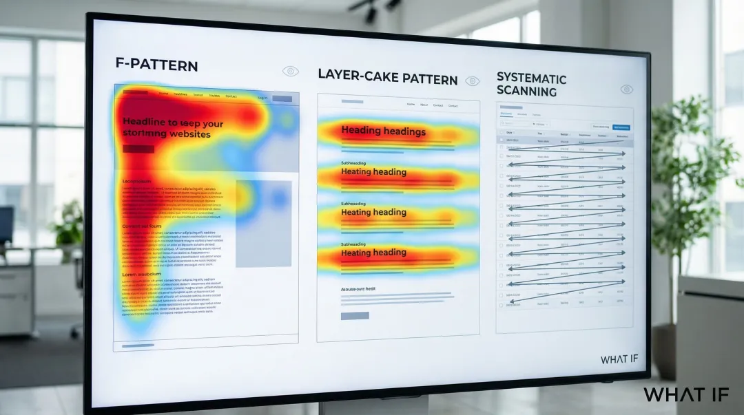
Use layout, typography, size, and color to guide user attention to primary actions and critical information. Visual hierarchy ensures users process information in the intended order without conscious effort. Understanding how users scan content shapes effective dashboard design.
Research on reading patterns shows that on text-heavy pages, users scan in an F-shape, focusing on the top and left sections. This behavior has remained consistent for decades. On pages with clear headings and subheadings, users apply a layer-cake pattern, skimming section titles to locate relevant content before reading. And on data tables or dashboards, users process cells in rows, moving across to the end of each row before dropping to the next.
In a demo or trial environment, what an evaluator notices in the first ten seconds of a new screen shapes their immediate impression of the product's clarity. That impression carries directly into the procurement conversation that follows.
3.3 Progressive disclosure
Reveal complexity gradually to avoid overwhelming users with too many options at once. Progressive disclosure moves advanced features to secondary screens, making applications easier to learn and less error-prone.
Effective implementation techniques include:
- Expandable menus: Show high-level categories initially, revealing subcategories on click
- Step-by-step wizards: Break complex processes into manageable sequential steps
- Contextual panels: Display detailed options only when users need them
- Toggles for advanced features: Hide power-user options behind "Advanced" sections, initially showing only key options with the full set available on request. This prioritizes novice users while keeping power features accessible.
For an enterprise or utility buyer evaluating unfamiliar software, progressive disclosure is often the difference between a first session that feels manageable and one that creates doubt about whether their team will be able to get up to speed.
3.4 Search and filtering
Strong search and filtering capabilities are essential in data-heavy SaaS applications where users need to find specific information quickly among thousands of records.
Autocomplete suggestions help guide users toward relevant results before they finish typing. Supporting multiple search criteria (by name, date, status, and category) means users aren't locked into a single lookup method. Results should display with a clear visual hierarchy, and filters should show the number of matching records for each option so users can gauge relevance at a glance. Letting users save frequently used search and filter combinations removes repetitive setup for recurring workflows.
Consider what happens during a pilot when a procurement manager tries to find a specific report or facility record and can't. That friction registers, and if it surfaces in a debrief, it's significantly harder to recover from than a missing feature.
4. Design effective onboarding and user guidance
4.1 Accelerating time-to-value
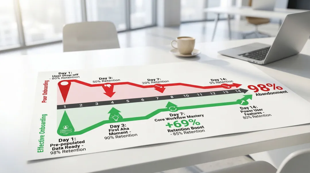
Carbon accounting tools, grid analytics dashboards, and ESG reporting platforms share a structural challenge that most consumer SaaS products don't face: users have to connect data sources, configure settings, or import existing data before they can see meaningful output. Unlike a productivity app where value is immediate, the first session in climate software often involves setup work with no visible payoff. That's where most users disengage, long before they've seen what the product can actually do.
Time-to-value (TTV), the time between signup and realizing product value, is the most critical factor in preventing churn. According to research from Amplitude, there is a 69% correlation between strong seven-day activation and strong three-month retention. Up to 91% of new users may abandon a product within 14 days if they don't find value quickly.
The onboarding experience needs to actively compress the setup phase, not just walk users through a feature tour. Getting users to their first "aha moment" requires removing friction from initial interactions. Replace blank screens with empty states that provide helpful guidance or sample data, pre-populate dashboards with example data so users can explore functionality immediately, and use guided tours that walk them through core workflows without extensive reading.
In our work with a grid analytics startup building monitoring dashboards for utility operations, pre-populating the interface with a representative sample dataset was the single most effective onboarding change. Before that change, most new users spent their first session navigating setup without ever seeing what the product could do. After pre-populating with a sample, users reached their first meaningful interaction within the initial session rather than returning later after completing setup on their own. Users need to see the product do something real before they believe it.
Platforms like Notion use templates to deliver immediate value, reducing the friction of starting from a blank slate. That same principle applies directly to climate software: give users a populated scenario to explore, a sample facility to analyze, or a pre-configured emissions report before you ask them to configure anything.
4.2 Contextual help and in-app guidance
For climate and energy software, in-app guidance isn't just a usability convenience: it's a pilot management tool. When an enterprise buyer is running a 30-day evaluation with their own team, the guidance you embed in the product directly determines whether their users succeed independently. A well-guided pilot reduces support volume, surfaces fewer objections, and gives the buyer team confidence to advocate internally.
Different types of in-app guidance serve different purposes:
- Tooltips: Brief explanations that appear on hover, ideal for explaining individual UI elements
- Walkthrough tours: Sequential guides that introduce core features step-by-step
- Interactive tutorials: Hands-on practice that teaches through doing rather than passive reading
- Help documentation: Comprehensive resources for users who prefer self-service learning
Use tooltips sparingly for unfamiliar interface elements. Show walkthrough tours during initial login but allow users to skip or dismiss them. Interactive tutorials work best for complex workflows that benefit from hands-on practice. Avoid over-guiding experienced users by detecting usage patterns and reducing guidance as users demonstrate proficiency.
4.3 Secondary onboarding
Continuing education is essential as users progress from beginners to power users. Don't assume onboarding ends after the first session. Introduce advanced features over time as users master basic functionality.
Progress checklists work well here, giving users a visible sense of what they've accomplished and what's next. Feature announcements introduce new capabilities when users are ready for them rather than surfacing everything at once. Contextual prompts suggest advanced features when users encounter a situation where those features are directly relevant.
For climate software teams managing a pilot-to-contract conversion, secondary onboarding is often the difference. Users who've only scratched the surface during a trial are more likely to churn at renewal. Users you've progressively introduced to advanced capabilities are more likely to see the product as embedded in their workflow before that conversation happens. The goal isn't just getting users through setup. It's getting them deep enough into the product that replacing it becomes a real cost.
4.4 Personalized onboarding
Tailor onboarding based on user role, industry, or stated goals to increase relevance and reduce time-to-value. In our experience, generic onboarding flows are significantly less effective than personalized ones.
Kit (an email marketing platform) asks new users what tool they're switching from, then tailors the onboarding flow to bridge the gap between familiar terminology and new workflows. Trello and Figma achieve high completion rates by using interactive walkthroughs that teach through hands-on practice rather than passive reading. The same approach applies to climate software: an operations manager at a utility and a sustainability analyst at a manufacturing company have different starting points, and routing them through the same generic onboarding creates unnecessary friction for both.
If your team is working through slow activation rates or an onboarding flow that hasn't kept pace with how your product has grown, that's usually the highest-leverage place to start. We work with climate and energy software startups to identify where that friction is and close it before it costs pilots.
5. Maintain visual consistency with design systems
5.1 Building a design system
For climate and energy software, visual inconsistency isn't just a design quality problem. It's a procurement signal. When interface components differ across screens (different button styles on the dashboard versus the reporting module, inconsistent chart treatments across facility views, spacing that shifts between features), enterprise evaluators read it as a sign that the product is still in development. Utility procurement teams and enterprise IT reviewers have seen enough early-stage software to recognize the pattern, and once that perception forms, it's difficult to reverse within a single pilot cycle.
A design system is a complete set of standards intended to manage design at scale using reusable components and patterns. It creates a single source of truth that keeps your interface consistent as your product grows.
Core components include:
- Color palette: Primary, secondary, and accent colors with specific usage guidelines
- Typography: Font families, sizes, weights, and line heights for different contexts
- Spacing: Consistent margins, padding, and grid systems
- Icons: Unified visual language for interface symbols
- UI components: Reusable buttons, forms, cards, modals, and navigation elements
- Interaction patterns: Standard behaviors for hover states, transitions, and animations
The business impact of well-implemented design systems is measurable. One published case study from a fintech SaaS team found that implementing a design system led to 50% faster design-to-development handoffs and allowed designers to complete tasks 34% faster. UI rework time dropped from 30% to around 10%. Cross-functional collaboration improved because designers and developers were working from the same reference. New features maintained visual consistency automatically, without each team member having to make independent judgment calls about spacing or component behavior.
We've seen this pattern directly in our work. With Ribbit Network on their environmental monitoring platform, addressing design system consistency was one of the first priorities. The result was a visually coherent interface that procurement evaluators could assess as production-ready, rather than flagging as still in development. Consistent domain-specific components, including energy consumption charts, carbon tracking widgets, and emissions dashboards, did two things at once: they reduced engineering overhead and signaled that the product was built for the long term.
The same outcome applies across climate software categories. When the visual language of your grid analytics dashboard is consistent from the summary view through to the facility-level drill-down, the product communicates readiness in a way that no sales conversation can substitute for.
5.2 Ensuring visual harmony
Consistent spacing, alignment, and layout grids across all screens reduce cognitive load and build user confidence. When interface elements behave predictably, users can focus on their tasks rather than relearning the interface on each screen.
Visual consistency signals professionalism and reliability, qualities that matter especially when your buyers are large enterprises, utilities, or government agencies making multi-year procurement decisions. An interface that looks inconsistent across screens introduces doubt about whether the product is production-ready, and that doubt is hard to reverse once it forms.
For early-stage climate software teams, the fastest way to elevate perceived product maturity is often not adding new features. It's making the existing interface look like it was built as a whole rather than assembled incrementally.
5.3 Responsive design for multiple devices
Field teams, plant operators, and remote monitoring personnel using climate and energy software don't always have access to a desktop. Users checking dashboards on tablets at industrial sites or reviewing alerts on phones have the same need for clarity as desktop users, but with different constraints. Mobile compatibility for these products isn't optional.
Maintain consistency while adapting layouts for different screen sizes:
- Use fluid grids that resize proportionally rather than fixed pixel dimensions
- Implement breakpoints at common device widths (320px for phones, 768px for tablets, 1024px for desktops)
- Prioritize content differently on mobile, hiding secondary elements to focus on core tasks
- Test thoroughly across actual devices, not just browser resize tools
If your product surfaces in a procurement evaluation and a reviewer opens it on a tablet to check a dashboard, that experience needs to hold. Many enterprise evaluations include informal testing that product teams never see happening.
If your team is building or scaling a climate software product and the visual inconsistency is already visible to your own team, it's visible to every evaluator who sees a demo or runs a trial. We work with climate and energy startups on design system setup from the ground up, and we can tell within a single session whether the current state of a product will pass or fail an enterprise credibility check.
6. Optimize for performance and responsiveness
6.1 Loading states and feedback
For utilities, industrial buyers, and government stakeholders evaluating climate software, loading performance creates a specific risk. These buyers often operate in strict IT environments with older hardware or limited bandwidth. A product that loads slowly or shifts layout unexpectedly creates friction that procurement teams flag as a risk, often before any other evaluation criterion.
Immediate visual feedback for user actions is critical for perceived responsiveness. Users need confirmation that their clicks, form submissions, and other interactions have registered.
How to handle slow-loading content:
- Skeleton screens: Show content structure while data loads, reducing perceived wait time
- Progress indicators: Display loading bars or spinners for operations that take more than 1 second
- Optimistic UI updates: Show the expected result immediately, then reconcile with the server response
- Success and error messages: Confirm completed actions and clearly explain any problems
When a key workflow stalls during a demo with no visual feedback, the evaluator's attention shifts from the product to the problem. If it happens more than once, it becomes the thing they remember. Loading state design is a risk management decision for every demo and trial environment you send an enterprise buyer into.
6.2 Micro-interactions and animation
Subtle animations enhance perceived performance by creating visual continuity: they signal that something happened as a result of the user's action. Well-designed micro-interactions help users build an intuitive model of how the product works, reducing the mental load of navigating unfamiliar workflows.
Button hover states provide visual confirmation that elements are interactive. Drag-and-drop interactions need clear indicators showing where items can be placed. Notification animations should draw attention without disrupting the user's current task.
Keep animations brief (200-300 milliseconds) and purposeful, where every movement communicates something rather than adding visual flair. In an enterprise demo, the cumulative effect of well-designed micro-interactions is a product that feels production-ready. That matters when you're being evaluated against a more established competitor whose product has years of polish.
6.3 Technical performance
Technical performance is where design decisions meet real business outcomes. Google's Core Web Vitals (Largest Contentful Paint, or LCP; Interaction to Next Paint, or INP; and Cumulative Layout Shift, or CLS) provide a measurable framework for understanding how loading speed and visual stability translate into user behavior.
Performance improvements deliver measurable business outcomes:
| Company | Improvement | Business result |
|---|---|---|
| Vodafone | 31% better LCP | 8% increase in sales |
| Tencent Video | Passed Core Web Vitals | 70% better click-through rate |
| AliExpress | 10x better CLS, 2x better LCP | 15% reduction in bounce rates |
| Agrofy Market | 70% better LCP | 76% reduction in load abandonment |
Target LCP under 2.5 seconds, INP under 200 milliseconds, and CLS under 0.1 for optimal user experience. These numbers translate directly to your sales outcomes. A product that feels slow or unstable creates doubt, and doubt is expensive in sales cycles that already run six to eighteen months.
7. Design for accessibility and inclusivity
7.1 Web accessibility standards
WCAG 2.2 defines the current standard for web accessibility, published in October 2023. It extends WCAG 2.1 with nine new success criteria focused on users with cognitive and learning disabilities, low vision, and mobile users.
WCAG defines three conformance levels: A (minimum), AA (target for most organizations), and AAA (highest). Level AA is the compliance target most relevant to legal and market requirements.
If you're selling to government agencies, utilities, or large enterprises, WCAG 2.2 Level AA compliance is often a procurement requirement rather than an optional enhancement. Meeting these standards removes a potential blocker in the sales process and signals that your product is built for institutional buyers.
To meet these standards, focus on several key areas:
- Color contrast: Maintain 4.5:1 ratio for normal text, 3:1 for large text
- Keyboard navigation: Ensure all functionality is accessible without a mouse
- Screen reader compatibility: Use semantic HTML and ARIA labels appropriately
- Focus indicators: Provide clear visual feedback showing which element has keyboard focus
Accessibility benefits all users, not just those with disabilities. Clear error messages, sufficient touch targets, and logical navigation improve usability for everyone.
7.2 Inclusive design principles
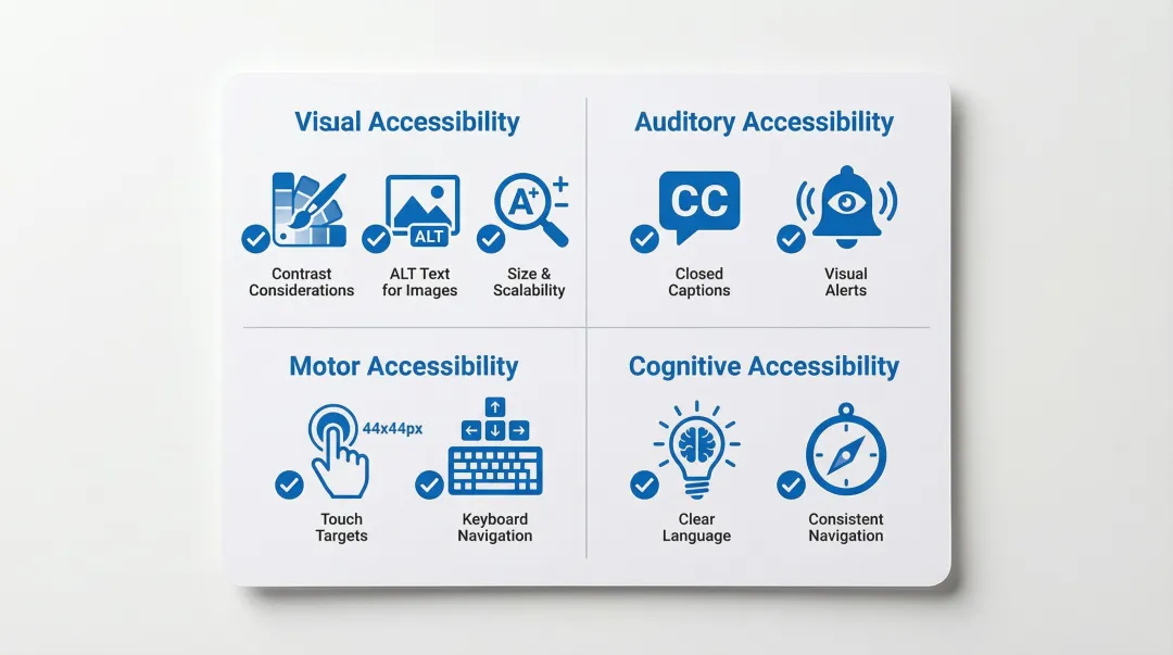
Beyond WCAG compliance, inclusive design means creating experiences that work for users with different abilities, contexts, and constraints:
- Visual considerations: Provide text alternatives for images, use color plus additional indicators (icons, labels) to convey information
- Auditory considerations: Include captions for videos and visual alternatives for audio alerts
- Motor considerations: Ensure touch targets are at least 44x44 pixels, support keyboard shortcuts
- Cognitive considerations: Use clear language, provide clear error messages, maintain consistent navigation
Translate these principles into action: add descriptive alt text for all images, include captions and transcripts for video content, write error messages that explain the problem and how to fix it, ensure touch targets are large enough for users with motor impairments, and use clear, simple language throughout.
For products being procured by government agencies or regulated utilities, demonstrating these practices signals that your product is built to institutional standards. That distinction can be the difference between passing and failing a vendor accessibility assessment.
7.3 Testing for accessibility
Test thoroughly, because multiple approaches catch different issues.
Start with automated checkers like WAVE, which identify common issues quickly. Then test your entire application using only keyboard controls to catch navigation gaps that automated tools miss. Finally, use NVDA or JAWS to experience your application as blind users would.
The W3C provides a Quick Reference checklist for meeting WCAG 2 standards. IBM's Carbon Design System follows the IBM Accessibility Checklist based on WCAG AA and Section 508. Running these tests before you enter procurement conversations means you can answer accessibility requirements with confidence, rather than discovering a compliance gap during vendor due diligence that stalls or ends a deal.
8. Where to focus first
If you're working through any of these challenges (slow activation rates, an onboarding flow that hasn't kept pace with your product, or an interface that works well for your team but confuses new users), the most useful next step isn't redesigning everything at once.
Start by mapping where users drop off in their first session. That gap between signup and first meaningful action is usually where the most leverage is, and it's often something structural: unclear navigation, missing guidance at a critical moment, or a workflow that assumes familiarity the user doesn't yet have.
We work with climate and energy software startups to identify and close those gaps: from UX research and flow refinement to design system setup and developer-ready handoff. If what's described in this guide is visible in your product right now, that's what we work on. Reach out for a UX audit.
9. Frequently asked questions
9.1 Why does UX design matter for SaaS applications?
UX design directly impacts whether users reach value before they disengage. When the interface makes it hard to complete core tasks or understand the product's purpose, users leave before the product has had a chance to prove itself, often within the first two weeks. For SaaS products competing against established tools, that window is short and the cost of losing it is high.
9.2 How do you prioritize UX improvements when your startup has limited design resources?
Start with activation. Map where users drop off in their first session and address the biggest friction point before anything else. That typically means improving onboarding clarity, fixing confusing navigation, or removing whatever step is blocking users from reaching their first meaningful outcome. One focused improvement to the critical path delivers more return than broad cosmetic changes spread across the whole product.
9.3 When does a climate or energy software product need a design system?
Earlier than most teams expect. The signal is usually when you start noticing inconsistencies: different button styles across features, mismatched data visualizations, or new screens that look slightly off from existing ones. For products being evaluated by enterprise or utility buyers, these inconsistencies signal immaturity and create doubt about production readiness. A lightweight design system (even just a shared component library with documented patterns) prevents this problem from compounding as the product scales.
9.4 What makes a SaaS onboarding flow effective?
Effective onboarding reduces time-to-value by guiding users to their first success quickly. Focus on progressive disclosure: show core features first, introduce advanced capabilities gradually as users gain confidence.
9.5 How often should you conduct user testing for SaaS products?
Test continuously throughout development, not just at launch. Run usability tests with 5-8 users per iteration to identify major issues. Monthly testing cycles help catch problems before they impact retention.
9.6 How does UX design impact sales cycles for enterprise software?
For complex software products, especially in energy, climate, or industrial sectors, poor UX directly lengthens the sales cycle. When enterprise buyers can't evaluate your product independently through a trial or demo environment, they rely on your sales team to walk them through it. A well-designed product that users can navigate without guidance reduces that dependency and shortens the evaluation period.
9.7 What makes onboarding harder for climate and energy software?
Most climate and energy software products require users to configure data connections, import existing datasets, or set up reporting parameters before they can see meaningful output. Unlike consumer apps where value is immediate, your product likely has a mandatory setup phase. Onboarding design needs to compress that phase: breaking it into guided steps, pre-filling where possible, and showing progress clearly, so users experience value before patience runs out.