Nielsen Norman Group calls conversion-rate improvement one of the strongest ROI arguments for UX investment. Its research on usability redesigns found an average 83% improvement in business metrics. A number too large to dismiss as design opinion.
Here's the pain point: for technical and B2B products, "conversion" rarely means an easy purchase button. It might be a demo request, a pilot sign-up, or an investor reaching out after reading a pitch deck. That ambiguity makes budget conversations harder, not easier.
This post breaks down what conversion rate actually measures, what counts as "good," how UX mechanically moves it, and how to build a data-backed case for design investment your finance team will accept.
TL;DR: key takeaways
- Conversion rate turns subjective design opinions into a measurable business metric finance teams trust
- A "good" rate beats your own historical baseline, not a generic industry average
- UX drives conversion by cutting friction and closing the gap between usability and buying decisions
- Isolating UX's contribution to revenue requires controlled testing, not guesswork
- Prioritizing fixes by dollar impact beats gambling on a full redesign
1. What is a conversion rate, and why it's the language of business
Conversion rate has a deceptively simple formula: conversions divided by total visitors, multiplied by 100. If 2,000 out of 100,000 site visitors complete your target action, that's a roughly 2% conversion rate, tracked over a defined period rather than a single day's snapshot.
1.1 Beyond the purchase: what counts as a conversion event
For ecommerce, conversion usually means "bought something." For technical and B2B companies, it's rarely that simple. A conversion event might be:
- A demo request submitted through a contact form
- A whitepaper or technical spec sheet download
- A partnership or pilot-program inquiry
- An investor reaching out after viewing a pitch deck
- A qualified lead completing a multi-step contact flow
Each represents genuine buying interest, even without a credit card involved.
The mistake we see most often: teams pick the conversion event after the redesign, working backwards from whichever number moved. That is the fastest way to lose a CFO, because the goalposts visibly shifted.
1.2 Why rate beats raw count
Raw conversion numbers rise and fall for reasons that have nothing to do with your website. A campaign spikes traffic, a conference mention drives a temporary surge, a slow month drags numbers down. Conversion rate normalizes for traffic volume, isolating whether your design, not your marketing spend, is doing its job.
1.3 Microconversions: early warning signals
Waiting for a macro-conversion to judge a redesign can take weeks in a long B2B sales cycle. Microconversions give you a faster read:
- Scroll depth past key value propositions
- Video plays on a product explainer
- Clicks on pricing or "how it works" links
- Time spent on technical documentation
Pick a consistent measurement window, weekly or monthly, aligned with your release cycle, so one traffic spike doesn't skew your baseline.
Conversion rate ties design choices to business outcomes. It's the metric executives and investors actually watch.
2. What's a good conversion rate? Setting realistic benchmarks
Is 2.5% good? 4%? There's no universal magic number. A good conversion rate is one that beats your own historical baseline, not an average pulled from someone else's report.
That said, external benchmarks give useful context. Unbounce's 2024 landing-page report, drawn from 41,000 pages and 464 million pageviews, found these medians:
| Category | Median Conversion Rate |
|---|---|
| All industries | 6.6% |
| Ecommerce | 4.2% |
| SaaS | 3.8% |
| Commercial/professional services | 6.roughly 2% |
B2B and high-consideration sales (climate tech, deep tech, anything requiring procurement sign-off) typically convert lower than these medians. Longer sales cycles, multiple stakeholders, and legal review all slow the funnel, regardless of how polished the UX is.
Several factors shape your rate that UX can't fully control:
- Brand reputation: an unfamiliar startup faces more skepticism than an established name
- Price and deal size: bigger commitments mean slower, more deliberate decisions
- Sales complexity: a one-click purchase converts differently than a multi-stakeholder pilot approval
- Ask size: reading a blog post is a lighter lift than requesting an enterprise demo
Compare your funnel to itself over time. That's the benchmark that actually matters.
3. The business case: how UX directly moves the conversion needle
Good UX moves conversion by removing friction between interest and action. Peter Morville's honeycomb model breaks "good UX" into seven facets: useful, usable, findable, credible, accessible, desirable, and valuable. Miss one, say a technical product page that's usable but not credible, and prospects hesitate.
3.1 The gap between "can" and "will"
Usability testing routinely shows high task-success rates while real-world conversion sits in the low single digits. Users can complete the task. They just choose not to. That gap is where UX earns its keep.
3.2 Proof in practice
CXL's TruckersReport case is one of the more thoroughly documented examples. A landing page form went through six rounds of testing: responsive redesign, benefit-focused copy, social proof, a shorter form, moving conversion from 12.1% to 21.7%, a 79.3% relative lift. No new traffic, no new budget. Just fewer barriers.
💡 Working through this decision right now? If you're a climate-tech or deep-tech founder weighing this trade-off, Book a strategy call with our team, 25 minutes, no pitch, and we'll pressure-test your specific situation.
3.3 Trust signals matter more for technical buyers
A climate tech or deep-tech buyer is often evaluating a technology they don't fully understand, from a vendor they've never heard of. Trust-building UX elements do heavy lifting:
- Testimonials and named case studies
- Security and compliance signals
- Technical specifications presented clearly, not buried
- Leadership and advisory-team credibility
When we redesigned HYDGEN's website, industrial decision-makers were struggling to understand a complex product: decentralized hydrogen generation. The work went beyond visual polish.
Clearer information architecture, leadership bios, technical specs down to the 50 kW electrolyzer level, and credibility markers throughout gave investors and enterprise buyers the context to evaluate the technology on its merits.
3.4 Performance is a UX lever too
Speed counts as UX. Deloitte's research on mobile sites found a 0.1-second load improvement correlated with 8.4% higher retail conversion and 10.1% higher travel conversion. Slow pages cost revenue before a prospect even sees your value proposition.
3.5 More conversions isn't always the goal
Maximizing conversion rate isn't the same as maximizing revenue. A lower conversion rate at a higher deal value (enterprise pricing over self-serve, a qualified pilot over a mass sign-up) can produce a better business outcome. Price elasticity matters as much as friction.
See how we have approached this in practice: How UI/UX design strategically boosts web app conversion rates.
4. Calculating the ROI of UX investment
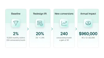
Let's walk through a simplified example modeled on form simplification, a common, high-leverage fix.
Sample scenario:
- Baseline conversion rate: roughly 2%
- Monthly visitors: 10,000 (200 conversions/month)
- Conversion lift after redesign: roughly 20% relative (roughly 2% → 2.roughly 4%)
- New conversions: 240/month, a gain of 40
- Value per conversion: $2,000
- Annual impact: 40 x 12 x $2,000 = $960,000
4.1 Establishing value per conversion in B2B and technical sales
A "conversion" isn't always a sale, so its value isn't always obvious:
- Demo request value = average deal size x close rate. A $50,000 average contract with a roughly 15% demo-to-close rate values each demo at $7,500.
- Investor inquiry value = tied to the funding round's cost of capital or the value of a warm intro over a cold one.
- Pilot sign-up value = projected contract value if the pilot converts, discounted by your historical pilot-to-contract rate.
4.2 Cost, payback, and proof
Flip the calculation around for the cost of inaction. If your form has a drop-off that user research attributes to confusing fields, multiply that percentage by your average deal value and monthly qualified traffic. That's what poor UX costs every month, whether or not anyone approves a redesign budget.
Once you have a projected annual gain, compare it against redesign cost: design, testing, and engineering time. A $960,000 projected impact against a $60,000 investment is a payback period of roughly three weeks. That's the number that gets budget approved.
None of this holds up to finance scrutiny unless you control for other factors. Marketing spend, pricing updates, and seasonal demand can all move conversion independent of UX.
A/B testing is the only way to confirm the lift comes from the design change. Run the redesigned flow against the original with randomized traffic so you isolate UX from everything else happening at the same time.
5. Building the business case: A practical framework for getting buy-in
Getting buy-in for UX investment takes more than a polished mockup. You need a clear sequence that makes the financial case undeniable before you ask for budget.
5.1 Baseline and find the drop-off
Before proposing any redesign, pull your analytics and find the single biggest leak in the funnel: the pricing page, the demo-request form, or the onboarding flow. Document the current conversion rate at that step. Everything else gets measured against it.
5.2 Diagnose with lightweight research
A drop-off point tells you where users leave. It doesn't tell you why. Close that gap with:
- User interviews with recent prospects who didn't convert
- Session replays showing where people hesitate or rage-click
- Quick usability tests on the specific flow in question
Fixing the wrong problem wastes both budget and credibility.
5.3 Prioritize by dollar impact, test incrementally
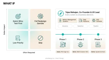
Rank potential fixes by projected dollar impact against effort required, then test the highest-value, lowest-effort changes first. Skip the full redesign gamble. A phased approach builds momentum for further investment.
That prioritization gets harder when the product itself is difficult to explain. Climate tech and deep-tech founders often need a specialist lens here. Tejas Mahajan, co-founder and UX lead at What if Design, treats every screen as a business decision. His work on battery management systems, fleet platforms, and ESG software is shaped by growth metrics: adoption, retention, and pipeline, not visual polish alone.
For a founder turning a hydrogen electrolyzer or carbon-capture process into an interface, that framing changes what ships first. Each change should earn the next pilot sign-up, warm investor intro, or signed contract.
6. Metrics that prove UX impact beyond the conversion rate
Conversion rate tells you the outcome. These metrics tell you why it's happening, surfacing problems before a full conversion cycle completes.
- Bounce rate and time on page flag friction early. A high bounce rate on a technical spec page might mean the content doesn't match what visitors expected.
- Click-through rate on CTAs shows whether your visual hierarchy and copy are guiding attention. A buried "Request a Demo" button underperforms no matter how good the offer is.
- Task completion rate measures whether users can complete an action, independent of whether they ultimately choose to.
- Error rate catches friction that task completion alone can miss, like a form field rejecting valid input.
None of these replace conversion rate as the ultimate measure of business impact. Tracked together, though, they turn a single lagging indicator into a diagnostic system.
Get this right and you get alignment: your team, your investors and your buyers all read the same story the same way. Get a free strategic audit.
7. Frequently asked questions
7.1 Is 2.roughly 5% a good conversion rate?
Yes, 2.roughly 5% sits within typical benchmarks for many industries. Whether it’s actually good still depends on your industry, traffic quality, and the action you’re measuring.
7.2 What is a good conversion rate for a website?
Most benchmarks place website conversion between roughly 2% and roughly 6%, depending on industry and goal type. Comparing against your own historical performance matters more than chasing an industry average.
7.3 How does UX design improve conversion rates?
UX improves conversion by removing friction, building trust through credibility signals, and guiding users toward action with clearer navigation and messaging. It closes the gap between users who can complete an action and those who will.
7.4 How is conversion rate calculated?
Divide total conversions by total visitors, then multiply by 100. Measure it consistently over a defined period, such as weekly or monthly, aligned with your release cycle.
7.5 What metrics should I track to measure UX's impact on conversions?
Track bounce rate, time on page, click-through rate on CTAs, and task completion rate alongside conversion rate. Together, they show not just whether conversion moved, but why.
7.6 Should a business always try to maximize its conversion rate?
No. Optimizing, not maximizing, is the goal. Tactics like heavy discounting can inflate conversion rate while hurting overall profitability and deal value.
Ready to take the next step?
If you're weighing a design partner for climate, deep tech, or hard-to-explain products, Book a strategy call with our founders at What if Design, a no-pressure 25-minute conversation about what you're building and where design can help. You can also View our work to see how we've helped teams like yours, or Get a free strategic Audit of your current brand, website, or product experience.