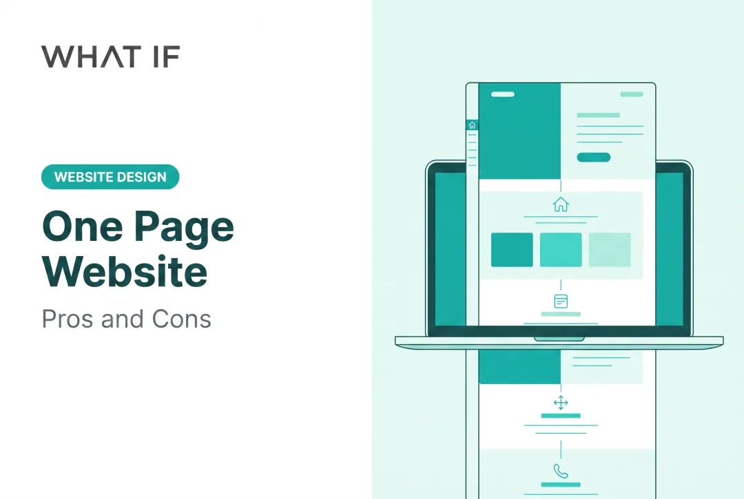
But long scroll cuts both ways. Done well, it builds narrative momentum and keeps mobile visitors engaged. Done poorly, it buries your CTA, tanks your SEO, and confuses the very investors or customers you're trying to convince.
This article breaks down when long scrolling actually works, how to implement it properly, and when you're better off with separate pages.
TL;DR: key takeaways
- Long scroll suits storytelling and mobile browsing, not task-driven or SEO-heavy pages
- Sticky navigation, jump-to sections, and fast load times are essential for good UX
- A hybrid model with a long-scroll homepage and focused interior pages usually beats an all-in-one site
- For technical products like climate tech, message clarity matters more than scroll length
1. What is long scrolling (and why do we keep doing it)?
Long scrolling is a finite, deliberately structured page where users move through content sections by scrolling instead of clicking to new pages. Smashing Magazine describes it as letting visitors move through "chunks of content without any interruption or additional interaction."
That's different from infinite scrolling, which is a listing pattern (think Instagram or Facebook feeds) that keeps appending new content endlessly. Nielsen Norman Group draws a clear line here: infinite scroll has no meaningful end. Long scroll does. It has a defined story, a footer, and a conclusion.
In short:
- Long scroll: a finite narrative with a clear end (Dropbox's guided product pages are a classic example)
- Infinite scroll: an open-ended feed that keeps loading more items
One tells a story. The other never stops.

1.1 Why am I endlessly scrolling?
The psychology is simple:
- Scrolling costs less effort than clicking and waiting for a new page
- Each section opens a curiosity gap that teases the next
- Variable rewards keep you moving because you never know exactly what's coming
This is exactly why infinite feeds are addictive. It's also why a badly designed long-scroll page can mimic that same "can't stop" feeling without ever delivering a clear next step.
2. When long scrolling works best
Long scroll shines when content is meant to be consumed in sequence, not searched or compared.
Ideal use cases:
- Storytelling-driven homepages and portfolios
- Narrative product pages that build a case step by step
- Long-form guides, infographics, and multi-step explainers that lose meaning if split apart
- Exploratory feeds (Pinterest-style), where discovery, not a fixed task, drives behaviour
Mobile is part of the reason this works. Mobile devices account for over half of global website traffic, according to Statista. In India, mobile share runs even higher. Vertical scrolling is simply more natural on a phone than clicking through paginated menus.
2.1 Deep tech and climate tech: A special case
This is where the pattern gets genuinely useful for hard-science companies. A climate tech startup with a novel carbon-capture solvent or a hydrogen production process has a real translation problem: the science is complex, but investors and partners need to grasp the value fast.
We worked with Susteon, a carbon capture and hydrogen incubator, on exactly this challenge. Their site introduced a portfolio of seven technologies, including a CO₂-capture solvent that cuts costs by 44% and captures over 97% of CO₂ from industrial flue gas.
Structuring that narrative section by section (the problem, the science, the proof point, the application) made a technical story legible to a business audience. That long-scroll structure is how What if Design turned Susteon’s science into a case investors and partners could follow.

2.2 When to avoid it
The same pattern fails when users are trying to complete a task, not follow a story. Long scroll falls apart on task-driven platforms:
- Dashboards where users track state across sessions
- Comparison-heavy tools (pricing tiers, product specs)
- E-commerce checkouts
NN/g's research is direct on this: continuous scrolling frustrates users who need to find something specific, compare items far apart, or revisit only a few items. These situations call for pagination, filters, or explicit navigation, not scroll.
3. Best practices for designing long-scrolling pages
Getting long-scrolling pages right takes more than stacking sections. A few non-negotiables:
1. Nail the above-the-fold hook. NN/g's eyetracking research found users spend 57% of viewing time above the fold and 74% within the first two screenfuls. Your headline and hero image still decide whether anyone scrolls further.
2. Add jump-to-section navigation. In-page links act as a table of contents and help users build a mental model of the page, according to NN/g. Label it "On this page" and keep destination headings visible after the jump.
3. Fix the technical basics:
- Use
loading="lazy"for below-the-fold images (never for your hero image) - Update URL state with the History API, not fragments, since Google generally doesn't index fragment-based content changes
- Preserve normal back-button behaviour
4. Never hijack scroll speed. NN/g calls this "scrolljacking" (forcing a fixed scroll rate) and found it disorients most users while hurting task success. Let scrolling behave normally.
5. Add loading feedback. Progress bars or loading indicators reassure users that dynamically loaded content is still coming.
6. Repeat your CTA. Don't bury it at the bottom. Place a specific action ("Request a pilot," "See the technical brief") at every logical break point, not just the finale.

4. Long scroll vs. multi-page sites: the SEO and conversion trade-off
Here's the trade-off nobody mentions in the design pitch: one long page cannot rank for as many distinct search queries as several focused pages.
Google's own SEO Starter Guide recommends organising topically similar content into separate, well-structured pages rather than cramming everything into one document. If "carbon accounting software" and "pilot program signup" are different search intents, they deserve different pages.
Performance compounds this problem. Google/SOASTA research found that as mobile load time increases from one to 10 seconds, bounce probability rises 123%. Long pages with heavy imagery are especially vulnerable here.
4.1 The hybrid solution
Rather than picking one model:
- Build a long-scroll homepage for the narrative: brand story, product vision, proof points
- Build dedicated interior pages for products, case studies, technical documentation, and blog content that need to rank independently
- Add section anchors and sticky nav so visitors can jump without losing the scroll story
This is the structure we lean toward for climate tech and deep tech clients: a homepage that tells the story in sequence, backed by focused pages that carry SEO weight. Engineers, investors, and procurement teams each need different entry points.

Before committing to either structure, validate with data. Scroll-depth tracking and heatmaps (Hotjar, Contentsquare) show whether visitors are actually reaching your bottom-of-page CTA. If most traffic drops off at section three, no amount of storytelling below that point matters.
5. Common long-scroll mistakes to avoid
Long-scroll pages fail for predictable reasons. Avoid these:
- Cramming unrelated topics into one page. This dilutes message clarity and SEO value. Pick one coherent story per page, not five.
- Overusing parallax on transactional pages. Animation slows down users trying to complete a simple task.
- Ignoring motion sensitivity. W3C flags parallax as often non-essential and a common trigger for vestibular disorders. Add a reduce-motion toggle or honour
prefers-reduced-motion. - Skipping content planning before design. For technical products, this is the mistake we see most often. Map story, audience, and conversion path first: workshops, content mapping, buyer-journey mapping, so the scroll convinces instead of confuses.
A site that reflects the company you have actually become is the cheapest credibility you can buy, and it puts you back in control of the first impression. Get a free strategic audit.
6. Frequently asked questions
6.1 What is long scrolling?
Long scrolling is a finite, structured page where users move through content by scrolling instead of clicking to new pages. Unlike infinite scroll, it has a defined ending and footer.
6.2 Why am I endlessly scrolling?
Low interaction cost, curiosity gaps between sections, and variable content rewards keep you moving without a conscious decision to stop. It's the same psychology behind social media feeds.
6.3 Is long scrolling good or bad for SEO?
It depends on structure. A single long page typically ranks for fewer distinct keywords than several focused pages targeting different search intents.
6.4 Should e-commerce sites use long scroll or pagination?
Long scroll suits browsing and discovery, like product feeds. Pagination suits comparison-heavy, task-driven shopping where users need to locate specific items.
6.5 How long should a scrolling page be?
Length should be dictated by content relevance, not a target word or section count. Stop when the story is told, not when you hit an arbitrary length.
6.6 Does long scrolling hurt website loading speed?
It can, especially with heavy imagery, but lazy loading and image optimisation largely offset the risk. The real danger is unoptimised media, not scroll length itself.