This matters more for climate tech, green tech, frontier-tech, and deep-tech companies, where the work is technically dense and the buyer often needs convincing on science and business value. If you're a founder, marketer, or product leader at a B2B tech company in India trying to turn your project history into something sales teams can actually use, this is for you.
A strong case study page does one thing well: it connects a recognisable business situation to the decisions made and the evidence that followed. Context, challenge, approach, solution, proof, next step — in that order.
Key Takeaways
- A credible case study page makes the path from business challenge to measurable outcome easy to follow
- The strongest pages balance strategic context, process evidence, final deliverables, and client proof
- Explaining trade-offs and decisions builds more trust than displaying polished outputs alone
- Confidentiality doesn't block proof: approved testimonials and before-and-after comparisons work too
- Design for scanning first, then let detail-hungry buyers dig deeper
What Is a B2B Tech Case Study Page?
A B2B tech case study page is a structured account of a project: the customer's context, the problem they faced, the approach taken, the solution delivered, and the value it created. Unlike a project announcement or portfolio thumbnail, it builds an evidence-based argument for causation: how the work actually contributed to an outcome.
That distinction matters because these formats get confused constantly:
| Format | What it communicates | What's missing |
|---|---|---|
| Portfolio entry | A project or client existed | Context, decisions, verified outcome |
| Testimonial | A customer liked the work | The causal story behind the result |
| Product page | What the solution offers generally | How one real customer deployed it |
| Case study | A complete, inspectable story | None; this is the full picture |
"Proof" doesn't mean revenue charts exclusively. It can be verified performance data, a named customer quote, a before-and-after product comparison, a documented workflow improvement, or a process artefact that shows how a decision was made.
Take Susteon Inc., a carbon capture company What if Design worked with. Their project delivered brand identity, website, event collateral, and pitch decks.
The proof wasn't a sales number. It was a 30% increase in career-page applicants after the redesign launched, alongside COO Sudarshan Gupta's testimonial that the process forced the team to "reflect on and rethink" its own corporate strategy. That's proof, even without a revenue figure attached.
A good case study page works as both a trust asset and a sales enablement tool. It helps a buyer assess relevance, capability, and working style before they ever get on a call.
How a Case Study Page Turns a Project Into Proof
Turning a project into proof means walking the reader through five connected moments. A finished product alone rarely persuades a B2B buyer.
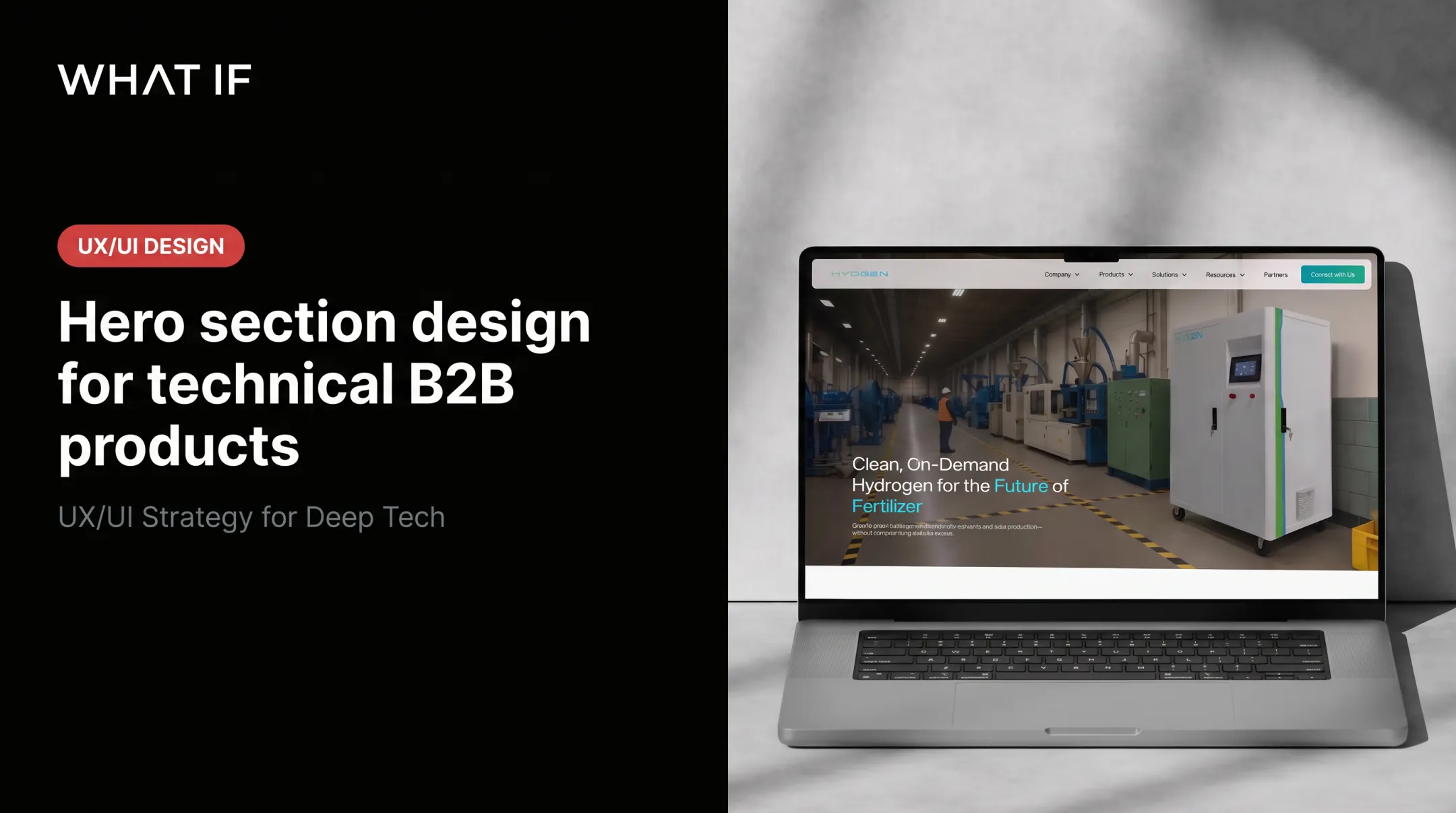
Start with the customer's situation, not your capabilities. Describe the company, its market, its audience, and the pressure it was under. HYDGEN's previous website, for instance, was dense and text-heavy. That density was a real constraint for a company trying to explain decentralised hydrogen infrastructure to investors and enterprise buyers simultaneously.
State the challenge and success criteria precisely. Separate the business problem from the design task. Batteryze's business challenge was recovering value and reducing waste from complex EV batteries safely. The design task was building a pilot platform with Pedal Movement in LA that gave fleet owners and insurers daily visibility into battery health.
Show the reasoning behind the work. Explain what was discovered, what constraints shaped the work, and what trade-offs got made. LabStart's rebrand started with a discovery workshop gathering leadership input on stakeholders, mission, and audience, then distilled that input into a creative brief before any design work began.
Present the solution as a direct response to the challenge. Annotated flows, diagrams, and prototypes work better than a screenshot dump. VendorX's user-flow diagram, for example, branches clearly into vendor and RFI journeys. The diagram shows decision logic alongside layout.
Prove the outcome with a hierarchy of evidence:
- Verified metrics (30% efficiency gain on a carbon-capture dashboard)
- Customer quotes with named roles
- Adoption or workflow evidence
- Before-and-after comparisons
- Delivery milestones
Research from Demand Gen Report's 2024 B2B buyer survey found that 67% of buyers cited content helping them build a business case or show ROI as a reason they chose the winning vendor. Scoped, attributable results matter more than promotional copy.
Close the loop by naming who benefited and what a similar buyer should take away. That last sentence is often missing. It is the line that makes the story transferable.

How to Design the Page for B2B Tech Buyers
Structure determines whether a reader finishes the page or bounces after the hero section.
Start with an outcome-led hero section
Write a headline combining the customer, the project scope, and a supportable outcome. Skip inflated claims. Underneath, add a short summary covering challenge, intervention, and result in two or three sentences.
Include high-signal details near the top:
- Industry and project type
- What if Design's role (brand, UX, product strategy)
- Timeline (Shine Solar's project ran just four weeks)
- A verified result or evidence label
Pair the hero visual with enough context that a first-time reader understands what they're looking at, not just that it looks polished.
Build a scannable problem-solution-results narrative
Organise the page around Challenge, Approach, Solution, and Impact. Use descriptive subheadings instead of generic ones like "Overview." Pull quotes and highlighted stats help a busy reader absorb the story without reading every line.
Use progressive disclosure: give the concise version first, then let readers who want more click or scroll into process detail, technical explanation, and supporting artefacts. Vested Futures' case study follows this pattern: project overview and outcomes up top, process and deliverables detail below.
Use visuals as evidence, not decoration
Every major visual needs a caption explaining its role. A screenshot gallery with no annotation tells the reader nothing about what changed or why.
Favour visuals that show change over time:
- Old-versus-new experience comparisons
- User journey maps
- System or architecture diagrams
- Prototype iterations
For climate and deep-tech projects especially, plain-language diagrams matter. Susteon's redesigned site used interactive elements and simple animations to explain its Sustenol™ solvent technology. That approach made a scientifically dense product understandable without overstating its impact.
Add authentic social proof and measurable evidence
Include a named quote with role and context wherever permission exists. Ribbit Network's Executive Director Keenan Johnson, for example, praised the team for understanding "important messaging" and translating it into a compelling visual experience. That kind of quote directly supports claims about clarity.
Make approved metrics visually prominent and define what each one measures:
- Timeframe for the result
- Comparison baseline used
- Measured result versus identified opportunity
If commercial data is confidential, use anonymised or directional evidence with client approval, supplemented by testimonials or workflow evidence.
Design the conversion path around buyer intent
Add a relevant CTA after the proof section: "Discuss a similar challenge" beats "Learn more." Link to related case studies or service pages based on what the reader's likely next question is.
Keep the page fast, responsive, and easy to navigate on mobile. Buyer behaviour backs this up: DGR's 2024 survey found that 72% of respondents shared content with relevant colleagues. Your page needs to hold up when it's forwarded, not just when it's first clicked.

Where the Case Study Page Fits in the B2B Buyer Journey
A case study rarely converts a single reader. It travels across a buying committee, and Indian B2B purchases tend to involve larger groups over longer cycles. Forrester's 2024 global research found an average of 13 decision participants involved in B2B purchases, with most deals touching two or more departments.
Different stages need different proof:
| Buyer stage | What they need | Page section to prioritise |
|---|---|---|
| Awareness | Category and problem context | Customer situation, challenge |
| Evaluation | Process and capability proof | Approach, decisions, visuals |
| Decision | Outcomes, risk reduction, contact path | Evidence, testimonial, CTA |
A climate-tech founder reviewing your work may care most about how you translated deep science into investor-ready language. HYDGEN's redesign moved away from generic corporate styling toward visuals that communicate technical sophistication to investors and enterprise buyers alike.
An enterprise buyer evaluating the Ministry of Health Saudi Arabia project, by contrast, cares about implementation and governance. That proof shows up in the Asset Performance Management dashboard tracking 45 new and 32 in-progress maintenance tasks.
Surface case studies where buyers actually look:
- Main navigation and industry pages
- Blog content
- Sales decks and proposals
Keep them out of a portfolio archive nobody finds. If you maintain a library, tag by industry, capability, and business challenge rather than building filters nobody needs yet.
Where a founder needs help turning complex technical work into a clear brand or product narrative, senior strategy-led design support from What if Design is one option to weigh against internal capacity.
Common Issues and When the Format May Not Work
More information doesn't automatically mean more credibility. Long timelines, dense technical copy, and screenshot-heavy pages often hide the evidence buyers need to trust you.
Common mistakes to avoid:
- Vague outcome language ("significantly improved results")
- Unverified or unsourced metrics
- Agency-centred storytelling that opens with capabilities, not customer context
- Unexplained visuals with no caption or rationale
- Anonymous testimonials with no name or role
- CTAs that don't match what the reader actually wants next
A full case study can also be premature. Don't force the format when:
- The project has no validated outcome yet
- The client hasn't approved publication
- Your team can't separate its contribution from other factors
This matters even more in climate tech, where pilot-stage work needs honest framing. CTVC's first-of-a-kind project checklist notes that real-world pilots should demonstrate operational, commercial, and impact indicators rather than being dressed up as mature commercial success.

When evidence is thin, these formats beat an overstated case study:
- Capability page for services you can prove in aggregate
- Short project snapshot when outcomes are still early
- Technical explainer for complex methods without ROI claims
- Annotated product walkthrough to show the work in context
- Single customer quote when you only have permission for that
Before publishing, run a final check:
- Permissions secured
- Data accuracy confirmed
- Mobile layout tested
- Page speed acceptable
- SEO title and description in place
- Internal links added
- Every major claim supportable
Conclusion
A B2B tech case study page is a designed argument connecting a recognisable challenge to a credible outcome. Build it on context, challenge, decisions, solution, evidence, and a clear next step.
For technically complex and climate-focused companies especially, accurate, approved, buyer-relevant proof will always outperform exaggerated claims. The point is recognition: a similar buyer should see their own problem in your story and trust that you can solve it again.
Frequently Asked Questions
What should a B2B tech case study page include?
Include customer context, the specific challenge, your approach and reasoning, and the solution delivered. Add evidence of impact, supporting visuals, a validated testimonial, and a CTA matched to the reader's next question.
How do you structure a case study for a technology project?
Use a Challenge–Approach–Solution–Impact structure. Include a project overview, decision rationale, process evidence, measurable results, and learnings where they add credibility.
How can a case study prove ROI without revealing confidential data?
Use approved anonymised or directional metrics, customer quotes, workflow or adoption evidence, and before-and-after comparisons. Permission-based reporting protects confidentiality while still showing real change.
Should a case study page focus more on visuals or written content?
Neither should carry the whole story alone. Visuals demonstrate what changed; concise writing supplies the reasoning, context, and evidence behind it.
How long should a B2B case study page be?
Length should follow project complexity and available evidence, not a fixed word count. Prioritise scannable sections with progressive disclosure so both quick readers and detail-seekers get what they need.
What makes a case study credible to B2B buyers?
Credibility comes from specific context, transparent decision-making, and verified evidence. Named customer validation and claims a similar buyer could realistically replicate seal trust.