Across 41,000 landing pages and 464 million visits, Unbounce found a median conversion rate of just 6.6% in its latest benchmark report. That means more than half of all landing pages convert below that number. The pages that beat it share a common structure: one offer, one audience, one CTA, and proof placed exactly where hesitation kicks in.
This guide walks through real lead-gen landing page examples across industries, a practical best-practices checklist, and what changes entirely when your audience is technical, meaning engineers, scientists, or climate-focused investors instead of everyday consumers.
TL;DR: key takeaways
- A lead generation landing page has one job: trade a specific offer for contact details
- Sharp, benefit-led headlines paired with proof next to the form convert best
- Shorter forms and tight message-match between ad and page consistently beat longer, generic pages
- Technical and deep-tech audiences want credibility and specificity, not urgency or emotional triggers
- Audit every page against conversion basics: offer clarity, proof, and form friction, before launch
1. A lead generation landing page, in one paragraph
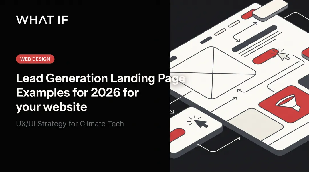
A lead generation landing page is a single-purpose page built to capture contact details, such as name and email, in exchange for one specific, valuable offer. That's it. No blog links, no pricing tabs, no "About Us" tucked into the nav bar.
This is what separates it from a homepage or a click-through/sales page:
- Homepages serve multiple audiences and multiple goals, with navigation encouraging exploration
- Click-through pages send visitors toward a transaction (checkout, subscription) using a button, not a form
- Lead generation pages use a form as the CTA and repeat that one ask throughout the page
Unbounce describes this distinction as the core difference between an ordinary web page and a true landing page: one campaign, one CTA, zero competing paths.
Message match matters too. A page's headline, copy, and design should mirror the ad or email that brought the visitor there.
Here's what these principles look like in practice across five industries.
2. Best lead generation landing page examples for 2026
Each example below was selected for three things: offer clarity, where proof sits on the page, and relevance to a different type of buyer, whether consumer, B2B, or technical.
2.1 SaaS demo request example
The setup: A mid-funnel technical buyer, say an IT or ops decision-maker comparing vendors, lands on a page offering a live product demo instead of a generic "contact us" form.
Why it converts:
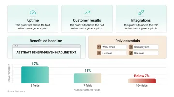
- Quantified proof (uptime, customer results, integrations) sits above the fold
- Headline states the benefit in one line, not the feature
- Form asks only for essentials before booking: work email, company size, use case
Form length matters more than most teams assume here. Unbounce's research on SaaS demo pages found conversion rates around 17% with five fields, dropping to 11% at seven fields, and below roughly 7% once forms hit ten or more.
| Element | Detail |
|---|---|
| Offer | Free personalized product demo |
| Audience | Mid-funnel technical buyer evaluating vendors |
| CTA | "Book My Demo" repeated at each scroll depth |
2.2 Ecommerce / DTC lead magnet example
The setup: A free downloadable guide or swipe file offered to ecommerce founders or performance marketers looking to scale ad spend or average order value.
Why it converts: Authority signals such as recognizable brand names, past client results, or years of experience appear before the ask. A "what's inside" preview section makes the value concrete instead of vague, so visitors know exactly what they're trading their email for.
| Element | Detail |
|---|---|
| Offer | Free downloadable guide or template |
| Audience | Ecommerce founders and performance marketers |
| CTA | "Get Instant Access" |
2.3 Financial services / fintech example
The setup: A capital-stack breakdown or savings guide aimed at a financially cautious, detail-oriented audience: property developers, investors, or budget-conscious consumers.
Why it converts: Clean, no-frills design signals professionalism rather than a sales pitch. A two-field form (name and email) keeps friction low for an audience that's naturally wary of sharing financial details.
Financial services also posts the highest median conversion rate Unbounce tracks, at 8.roughly 3%. Offers in this category tend to be highly specific, and visitors usually arrive with real intent.
| Element | Detail |
|---|---|
| Offer | Free structured finance or savings guide |
| Audience | Property developers, investors, or budget-conscious consumers |
| CTA | "Download Now" |
2.4 Real estate / home services example
The setup: A free workshop or in-home consultation offered to aspiring investors or homeowners weighing a major purchase decision.
Why it converts: The headline names a concrete outcome (not "learn about real estate investing" but "how to close your first rental in 90 days"). A short checklist shows exactly what the workshop covers, and testimonial cards further down reinforce that real people got real results.
| Element | Detail |
|---|---|
| Offer | Free workshop or in-home consultation |
| Audience | Aspiring investors or homeowners evaluating a big purchase |
| CTA | "Reserve My Spot" |
💡 Working through this decision right now? If you're a climate-tech or deep-tech founder weighing this trade-off, Book a strategy call with our team, 25 minutes, no pitch, and we'll pressure-test your specific situation.
2.5 Recruiting / application example
The setup: A fast job-application page for a remote role, built to be completed in under a minute, not five.
Why it converts: Speed is the entire pitch. The page sells simplicity first ("apply in 60 seconds") and handles trust objections such as confidentiality and no spam in a single line near the CTA, not a wall of legal text.
| Element | Detail |
|---|---|
| Offer | Fast, simple job application |
| Audience | Candidates seeking a specific remote role |
| CTA | "Apply Now (60 seconds)" |
See how we have approached this in practice: Landing page design for climate and deep-tech founders.
Case study: HYDGEN
HYDGEN needed a brand and website that could carry the weight of green-hydrogen infrastructure, technical enough for engineers, clear enough for policy-makers, credible enough for institutional investors. We built the brand system and website in a compressed sprint aligned to their fundraising milestone. See the full HYDGEN case study.
Our take (from actually doing this)
Reading twenty articles on lead generation landing page will give you the same five bullet points repeated in different fonts. Here's what actually moves the needle when we're inside a real engagement:
- The best decision is rarely the option with the lowest sticker price, it's the one that costs the least to change when your product or funding position shifts in six months.
- Founders consistently underweight the communication tax: how much of your week you'll spend re-explaining what you're building. The right partner should reduce that tax, not add to it.
- The only reliable way to de-risk this decision is to look at what a partner has actually shipped for teams like yours, not what they say they can do.
That's why our own recommendations lean toward specialists over generalists for climate and deep-tech work. If you want to pressure-test your specific situation, book a strategy call, 25 minutes, no pitch, and we'll be direct about whether we're the right fit.
3. Why climate tech and deep tech companies need a different lead gen playbook
Everything above works for consumer or mainstream B2B audiences. Engineers, scientists, VCs, and government evaluators respond to a different set of signals entirely. Urgency banners and countdown timers don't move a materials scientist. Credibility, specificity, and verifiable evidence do.
The core challenge is translation. The underlying science is often hard to explain in plain language, so the creative brief itself is frequently the hardest part for founders to write. You can't craft a headline for a carbon capture solvent or a grid-interconnection platform until someone understands how it works and why it matters to the buyer.
For this audience, consumer-style social proof gets replaced with:
- Research backing: grants, government partnerships, published data
- Pilot program results: real numbers from real deployments
- Technical specifications: the kind an engineer would actually check
- Named institutional partners: organizations a technical buyer already trusts
This shows up in practice. A hydrogen technology client's site leaned on hard specs: a 50kW electrolyzer, 99.9999% purity output, and 75-roughly 85% system efficiency, instead of star ratings. A climate venture studio's page displayed backing from the U.S. Department of Energy, the Autodesk Foundation, and other named institutional partners rather than generic customer logos.
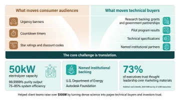
Lead magnets shift too. Edelman and LinkedIn's 2024 B2B survey of 3,484 executives found 73% trust thought leadership over marketing materials when judging a company's real capabilities. Technical whitepapers, pilot or partnership applications, and data-backed case studies outperform generic ebooks or discount codes for this crowd.
What if Design works on this translation problem every day. The studio partners with climate tech, deep tech, and hard-tech founders, including teams backed by the U.S. Department of Energy and ARPA-E. That work has helped client teams raise over $105M by turning dense science into pages technical buyers and investors trust.
One takeaway to apply now: lead with the "so what" of your technology in plain language first. Then back it immediately with one strong, verifiable proof point above the fold, not five weak ones buried in a features grid.
4. Lead generation landing page best practices for 2026
Run your page against this checklist before your next campaign goes live.
Message match and form length:
- Mirror the exact promise from your ad or email in the page headline
- Keep forms to 3-5 essential fields; every extra field adds drop-off risk
- Ask only for what you'll genuinely use in follow-up or qualification
Proof placement and CTA design:
- Place testimonials, logos, or results within one scroll of the form
- Swap generic "Submit" buttons for benefit-driven copy like "Get My Guide" or "Book My Demo"
- Repeat the same CTA phrase throughout the page instead of introducing new language each time
Mobile-first and single-goal focus:
- Design for mobile first; most landing page traffic in 2026 arrives on a phone, not a desktop
- Strip out navigation menus, footer links, and anything that isn't the form
- Offer one path to conversion, not three competing buttons pointing in different directions
5. Conclusion
A high-converting lead generation landing page in 2026 matches your offer, proof, and clarity to exactly who lands on the page.
Before your next campaign launch, run your page against the checklist above, paying close attention to message match and where your proof sits relative to the form.
If your offer is hard to explain, common in climate tech and deep tech, What if Design partners with founders to turn complex science into landing pages, brands, and products that close funding, partnerships, and customers.
When the story is clear, the next conversation starts from confidence rather than explanation. Get a free strategic audit.
6. Frequently asked questions
6.1 What is a lead generation landing page?
It's a single-purpose page built to capture contact details, like name and email, in exchange for one specific offer. Unlike a homepage or checkout page, it has no navigation and only one goal.
6.2 What are the best lead generation landing page examples?
Strong examples span SaaS demo pages, ecommerce lead magnets, fintech guides, real estate workshops, and recruiting applications. They all share one trait: a single clear offer paired with proof placed right next to the CTA.
6.3 What should a lead generation landing page include?
It needs a headline that matches the source ad, a clear value proposition, a short form, a benefit-driven CTA, and social proof such as testimonials or logos near the form.
6.4 How many form fields should a lead generation landing page have?
Stick to 3-5 essential fields. Add more only if you genuinely need the data for follow-up or qualifying the lead, since each additional field tends to reduce completion rates.
6.5 What's a good conversion rate for a lead generation landing page in 2026?
Unbounce puts the median conversion rate at 6.roughly 6%, with financial services around 8.roughly 3% and SaaS closer to 3.roughly 8%. Cold traffic converts lower than warm or referred visitors.
6.6 How is a lead generation landing page different from a homepage?
A homepage serves multiple audiences with multiple links and goals. A lead generation page strips all that away, built around one offer and one desired action: filling out the form.
Ready to take the next step?
If you're weighing a design partner for climate, deep tech, or hard-to-explain products, Book a strategy call with our founders at What if Design, a no-pressure 25-minute conversation about what you're building and where design can help. You can also View our work to see how we've helped teams like yours, or Get a free strategic Audit of your current brand, website, or product experience.