This happens constantly on technical B2B homepages, from carbon capture platforms to industrial software to climate data tools. The problem rarely stems from a lack of technical depth. It stems from presenting that depth in the wrong order, for the wrong audience, at the wrong moment.
Fixing this doesn't mean dumbing down the product. It means building a messaging hierarchy that gets the right information to the right decision-maker, in the right sequence. This article walks through that framework: defining your audience and value proposition, structuring the homepage around buyer questions, backing claims with proof, and testing the message with real people before calling it finished.
Key Takeaways
- First screen states category, who it’s for, the problem, and the outcome—in plain language.
- Translate features into commercial, operational, or environmental outcomes buyers care about.
- Treat the homepage as a guided decision path, not a technical manual.
- Back every major claim with proof: customer example, test result, or partnership.
- Test the copy with people who match your real buying committee before launch.
What Homepage Messaging Means for Technical B2B Products
Homepage messaging isn't a tagline or a paragraph of copy sitting under your logo. It's the combined meaning created by your headline, subheadline, page structure, visuals, proof points, navigation labels, and calls to action working together. Change any one of these and the overall message shifts, even if the words stay the same.
Technical B2B messaging is genuinely harder than consumer messaging for a few reasons:
- The product category itself may be unfamiliar to the visitor.
- The mechanism behind the product is complex and hard to summarise.
- Multiple stakeholders, each with different priorities, influence the decision.
- The benefits often take months or years to materialise.
Nielsen Norman Group's research on homepage design principles found that failing to communicate a site's purpose at a glance is a common reason prospective customers leave, especially when the organisation's name doesn't make the business obvious.
For a hydrogen electrolyser company or an ESG data platform, the name rarely does that work alone.
Consider the difference between these two approaches:
Feature-led: "Our platform uses a proprietary multi-sensor array with edge-computing inference."
Buyer-centred: "Catch equipment failures three weeks before they happen, without adding headcount to your maintenance team."
Both describe a real capability. Only one tells a buyer why it matters.
The homepage also has to serve different visitors without giving everyone the same depth. Technical evaluators, commercial buyers, partners, and investors all arrive with different questions.
The test for your first screen is simple: can a relevant visitor explain what you offer, who it's for, what problem it solves, and what to do next? If they can't, the hierarchy needs work before the copy does.
Build the Messaging Foundation Before Writing
Writing homepage copy before defining the foundation is how most technical B2B sites end up vague. Get these five things right first.
Identify the primary audience and buying context
Define your highest-priority segment, buyer role, and use case rather than writing for an undefined "market." Technical B2B purchases rarely involve one decision-maker. Forrester's 2026 State of Business Buying report found an average of 13 internal stakeholders plus nine external influencers shape a typical business purchase. That means your homepage is talking to a committee, not an individual. For each stakeholder, document:

- Their main problem and desired outcome
- Their perceived risk
- Their likely objection
Gather voice-of-customer language
Pull language from sales calls, support conversations, win/loss notes, and search queries. Keep technical terms that build credibility; explain ones that don't. Look for repeated phrases around urgency, cost, compliance, or reliability. These phrases often make better headlines than anything marketing invents internally.
Define the problem before the technology
State the specific problem first. Connect it to a consequence the buyer recognises, such as slower deployment or avoidable operating cost, without overstating the claim. Keep one problem at the centre; push secondary problems to deeper pages.
Find a defensible point of difference
Compare your messaging against competitors and the status quo. Separate points of parity (common category benefits everyone claims) from points of difference that are both relevant and provable. Explain the differentiator through a buyer outcome, not an adjective like "revolutionary."
Build the hierarchy
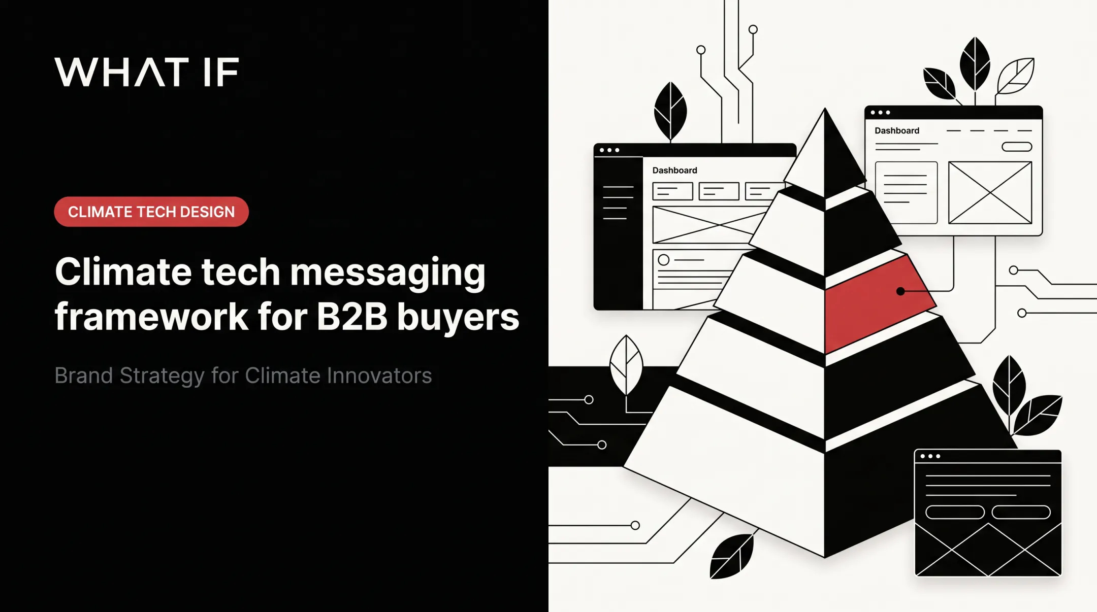
Establish one primary message (who you serve, what you provide, the most important outcome), then layer secondary messages for proof, use cases, and implementation detail. What if Design's Brand Positioning work with climate and deep-tech founders builds this narrative hierarchy in a four-to-six week engagement. It targets a problem technical teams raise often: communicating value clearly to B2B buyers.
Structure the Homepage Around Buyer Questions
Build the page around the questions a new visitor asks, not the order your team shipped features.
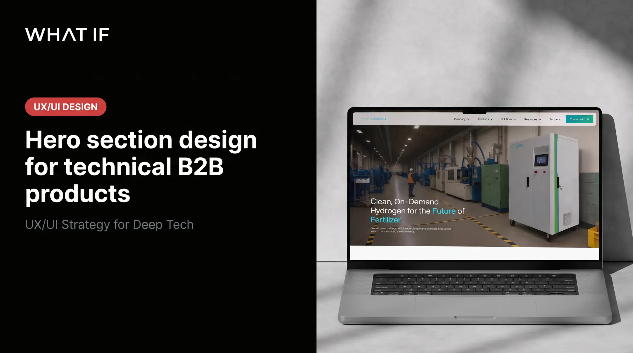
Build a hero section that answers the essentials
- Headline: Name the product category, customer, or problem. Skip the abstract mission statement.
- Subheadline: Clarify the mechanism or outcome in plain language while keeping necessary technical credibility.
- Primary CTA: One action that matches buying readiness, not three competing buttons.
Follow a logical sequence
A workable homepage order mirrors the buyer’s path:

- Offer clarity
- Audience
- Problem
- Benefits
- How it works
- Proof
- Use cases
- Implementation
- Objections
- Next step
Save deep technical detail—specifications, methodology, validation data—for linked pages once core value is clear.
Organise by use case when audiences diverge
If buyers come from different industries with different problems, don’t force them into one block of copy.
What if Design uses sector-specific routes for this: separate pathways for climate tech, green tech, electric vehicles, carbon capture, and ESG data. Each path repeats the relevant problem, proof, and CTA—not just a swapped page title.
Explain the product without writing a manual
Describe the product at three levels:
- What it is
- How it works at a high level
- Why that mechanism matters to the buyer
Diagrams and short demos help only when they clarify the written explanation, not replace it. Link out for specifications and deployment requirements.
Make navigation reinforce the message
Group pages by visitor intent—solutions, applications, technology, resources, company—not by internal department.
A footer split into Company, Resources, Services, and Expertise (as on What if Design) lets visitors self-select without knowing how the agency is organised.
Make Technical Complexity Clear, Credible, and Commercially Relevant
Technical depth and commercial clarity aren't opposites. The trick is sequencing them correctly.
Translate features into buyer outcomes
For every major capability, explain what it enables and what changes for the user. Separate immediate benefits (faster workflows, easier analysis) from longer-term outcomes (scale, cost control, resilience). Don't present environmental or financial impact as guaranteed unless it's backed by a defined methodology.
Use a layered explanation model

- Plain-language description for a first-time visitor
- Concise technical explanation for an evaluator
- Linked evidence for specialists
Define unavoidable terms on first use. Keep precise terminology where simplifying it would make the explanation less accurate. Nielsen Norman Group research on expert readers shows even specialist audiences prefer concise, scannable content over jargon-heavy walls of text.
Replace vague innovation language
Phrases like "transforming the future" or "smarter solutions" establish nothing about category, audience, or value. Rewrite abstract claims around a specific application or technical advantage. Keep mission and vision statements, just move them below the practical offer.
Address the risks that slow technical decisions
Give each a concise homepage response:
- Reliability and uptime
- Integration with existing systems
- Data quality and security
- Regulatory and compliance fit
- Internal adoption effort
Being transparent about where the product doesn't fit often builds more credibility than universal claims do.
Connect technical credibility to commercial relevance
Technical evidence should support a business decision: reducing uncertainty, easing compliance, or making investor conversations simpler. This is where climate tech and deep tech companies get stuck. The science is sound, but the website still reads like a lab notebook.
We work in that gap—learning the science and market first, then translating it into brand, website, and product experiences a non-specialist buyer or investor can act on. Our work with hydrogen-technology company HYDGEN and carbon-focused venture studio LabStart followed this path: understand the mechanism first, then build the story around it.
Use Proof, CTAs, and Pathways to Support Decisions
Clarity gets a visitor to understand you. Proof gets them to trust you.
Match proof to the claim it supports
Place evidence next to the promise it backs, not in one isolated "trust us" section:
- Customer logos and testimonials for usability claims
- Technical validation and test data for performance claims
- Deployment examples for implementation claims
- Transparent methodology for impact or sustainability claims
Only use substantiated figures from your own records. Never invent metrics or customer results.
Design CTAs for different levels of readiness
Gartner Digital Markets' 2025 software buying trends report found that 62% of buyers said trials played a key role in their final decision, and 54% said the same of demos. That's a strong argument for offering more than one CTA.

- One primary CTA for the highest-value next step
- Secondary CTAs for visitors needing more education first
- Specific wording ("Explore the technology," "Review the application") instead of generic "Learn more"
The same pattern shows up on What if Design's site: a UX Audit form alongside a separate 25-minute consultation booking. Visitors ready to act aren't forced through the same funnel as those still exploring.
Help an internal champion sell internally
A champion inside the buying company often needs to repeat your message to colleagues or procurement. Give them:
- Reusable language that doesn't overstate the product
- Accessible proof and diagrams they can screenshot or share
- Downloadable resources for complex, multi-stakeholder processes
Test, Refine, and Maintain the Message
A homepage is never actually finished. Treat it as a hypothesis, then test it.
Run a clarity review with unfamiliar people
Show the first screen for a few seconds and ask: what does this company offer, who is it for, and what would you do next? Record the exact words people use and where they get stuck. Repeat with both technical and commercial reviewers, since what feels vague to one group often reads as over-technical to another.
Validate against real behaviour
Review search queries, CTA clicks, form questions, and sales objections for recurring comprehension gaps. Compare performance by traffic source: visitors from technical content often need different confirmation than those from a partnership mention or a broad campaign.
Change one variable at a time—headline, CTA, or proof placement—and document what you learn.
Set a maintenance rhythm
Revisit the homepage when the product, market, or evidence base changes. Keep a simple audit checklist on hand:
- Clear offer and named audience
- Defined problem and meaningful outcome
- Defensible difference
- Relevant, current proof
- Logical navigation and appropriate CTA
Frequently Asked Questions
What is website messaging?
Website messaging is the combined language and structure used to communicate an organisation's offer, audience, value, credibility, and next step across its site. It's built through headlines, structure, visuals, and proof together, not a single tagline.
What is a brand message example?
A technical B2B example: "Grid operators use [Product] to detect interconnection risks before they delay a project by months." It names the customer, the problem, and the outcome without unsupported superlatives.
What should a website homepage include?
At minimum: a clear offer, named target audience, the problem solved, key benefits, relevant proof, pathways for different visitor types, a plain-language technical explanation, and one clear primary CTA.
How do you explain a technical product on a homepage?
Use a layered explanation: describe what the product is in plain language, explain how it works at a high level, connect it to a buyer outcome, then link to deeper technical evidence for specialists who want more.
How often should homepage messaging be updated?
Update it whenever the product, audience, market, or evidence base meaningfully changes. Between major updates, check customer feedback and on-site behaviour periodically to catch smaller drifts early.